

Alexander Grabovetskiy, woodcarver, School of Woodcarving · Published 2020
How do you space the divisions on a carved acanthus leaf?
Quick answer: Spacing the divisions of an acanthus leaf is a job for rhythm. The biggest space goes first, and each one after it shrinks a little, so the eye reads one smooth change. Even spaces look like boxes, and the outline of the leaf still gets the final say on where each division sits.
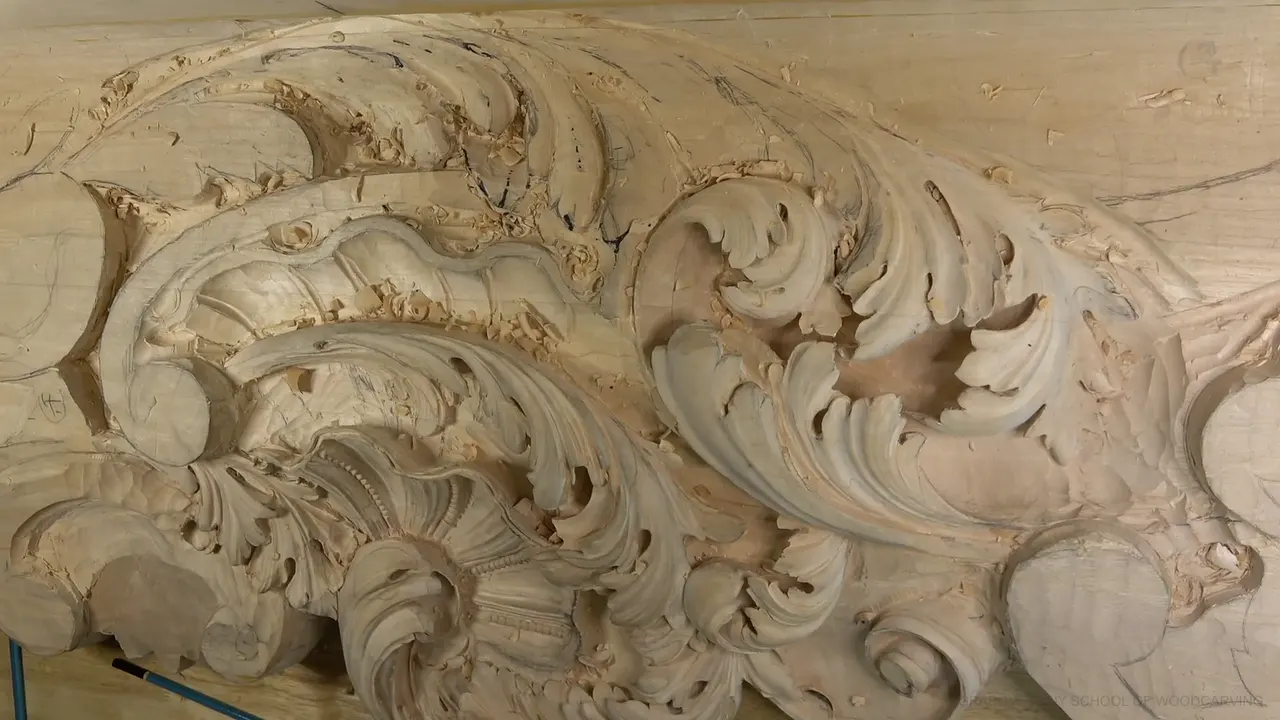
Spacing the divisions on an acanthus leaf is a matter of rhythm. The widest space comes first. Each space after it gets a little narrower, so the eye reads one smooth movement down the leaf instead of a row of boxes. That is the whole idea, and in acanthus carving it is the difference between a leaf that makes sense to the eye and one that just doesn't look right. Workshop 34 of the Venice Room is where I stopped carving to fix mine.
Have you ever looked closely at a leaf on a real plant? Were the gaps between its points a little different? Carve a leaf with even gaps and it looks stiff beside that plant, and late in the fourth part of this workshop, mine was heading that way. I'll give you the rule I used to pull it back. After that comes the gap I refused to leave, plus the one fix I gave up because it hurt the leaf.
The spacing on this leaf, in six lines
I made the widest space first and let every space after it shrink a little.
Where two edges made a gap like a rectangle, I moved a line.
When pushing that fix further would have bent the outline into a dip, the outline won.
Two divisions went a little higher instead.
More width went to an important leaf, and a second eye that would have crowded the first one stayed out.
The heavy ink came off before I judged the movement.

What does rhythm in design look like on a carved leaf?
On this leaf, it looks like spaces that shrink in order, the widest one first. Late in the fourth part I stopped and looked at the space between this point and that point, then the next space, and back again. One space was wider than another, and it didn't look right. So I said out loud what the law of rhythm asks of me. If this is the widest, this one is less wide, and that one has to be even less wide. That way it makes more sense to the eye.

Design books have a name for a change that moves one stage at a time, and they call it progressive rhythm. On the board it only means the next space is a little smaller than the one before it. When I was sixteen I became the only apprentice of a fine-art master in Russia, and he told me design is the laws of space, rhythm, repetition, and understanding the tools. My design course takes those laws one at a time. I ended that fourth video wondering how it was all going to look.
Designers call the gaps between parts negative space. On an acanthus leaf, the same leaf that curls around a Corinthian capital, those gaps are the spaces between the divisions.

Why shouldn't two spaces on a leaf be equal?
Equal spaces become shapes of their own. Right at the start of the fifth part I found one. The space between this edge and that edge was almost a rectangle, and that is what I saw. I didn't like it, because the spaces have to be gradual too.

I moved the line until I couldn't see the rectangle anymore. The space right here ended up smaller than the space right there, which is how it should be. I said so on the video, and I added that it was my opinion.
Look for rectangles on your drawing before a gouge touches the wood, while an eraser can still fix them.

What do you do when fixing the spacing puts a dip in the leaf?
You let the overall movement win. Once the rectangle was gone, the next space had to shrink too, and that pulled my line a long way over to one side. Then I stopped. I'm losing something, I said, and I said it twice. Pushed that far, the outline would get a dip in it, and I didn't want to see a dip like that.
The edge has to follow the overall movement of the leaf, very much so. Then it's organic. I double-checked, and instead I took this division a little higher and that one a little higher, because I still wanted all three nice and distinguishable. I think that is going to be good, I said.

Movements that disagree make a leaf look wrong in a different way, and workshop 26 is about that. These are the spacing problems I ran into on this leaf, and what I did about each one.
| Problem | Reason | Fix |
|---|---|---|
| A narrow leaf | An important leaf was not wide enough yet. | I widened its boundary line. |
| Unordered gap widths | The widths did not step down in order. | Widest, less wide, even less. |
| A rectangle gap | The gap between edges looked like a box. | I moved one line over. |
| A dipping outline | The fix put a dip in the outline. | Took two divisions higher instead. |
| Two eyes crowding | A second eye would crowd the first one. | Kept the movement gradual there. |
| Too many lines | Thick marker lines made me lose my place. | Chopped around them, then cleaned. |
| Too much inside | A separation had no room between its neighbors. | Made extra space for it. |
| An overlong division | Running all the way underneath would look unnatural. | That one stays fairly small. |

How do you keep a small division readable?
Keep the height beside it, and clean off whatever hides it. Readable is the word I kept using in this workshop. Halfway through part four, one division was almost unreadable, so I cleaned it a little, because it has to be readable. I said that twice as well.
Readable starts early. When I set out the divisions in the third part, a couple of notches from a number 11 marked them, because I did not want to lose any of them. I really want to see them.
An edge in the seventh part was going to sit underneath another shape anyway, and it wasn't deep. I still had to make it readable. I took a small number 11, about 3 mm (1/8 in), and went a little deeper right along its side, but not too deep, because I didn't want to lose the height of it. Lose that height and the edge stops being visible.

Shallow can still read. One separation in the tenth part stayed shallow, and I said it would still be readable, because a number 11 of just 1 mm (about 1/32 in) could go right there. Early in the eleventh part another edge had blended in until it was almost invisible, and I really wanted to see those separations, so a 1 mm spoon number 11 gave it a shadow.
Some of this the camera won't even show. One concave in that eleventh part is almost no concave on one side, yet it has a really nice movement upward, and I said the camera probably wouldn't catch it.
Venetian carvers of that time added extra separations for curl, and part 2 of this room has a whole lesson on them.

When does a leaf need more room instead of more detail?
An important leaf needs room before it needs detail. Near the end of that same fourth video, I had a boundary drawn for the next leaf. Since it would sit above the one beside it, its overall shape came first, and I didn't like the boundary, because it wasn't wide enough. It was a really important leaf, so I widened it. The eye and the pipe were going to run back from there, and I wanted a much wider area going downhill, with really nice separations.
Looking from above helps. When the next leaf was still only lines, it would make much more sense from above, I said, and later, in the tenth part, I showed how the section looked from up there.
Next I moved the eye itself. I could get by without it, but I still thought the eye would give me a really beautiful movement. A second eye was another story. It would have sat too close to the first one, so that stretch became a gradual movement instead. Where an eye goes at all is its own decision, and workshop 19 works through it on a Venetian head.

Eyes can make room, too. During the eighth part I planned one eye, then another, and the second one gave me space to divide that part later on. Back in the third part I also decided the main head needed subdividing, because without that it would still look nice, but not as detailed.
Crowding happens inside a leaf too. The ninth part had too much going on inside, so I made extra space for one separation. A division can also run too long. If it runs all the way underneath, it looks unnatural, so that one doesn't have to be big.
Too much bulk is the opposite trouble. In part four there was too much of it in one spot, and it just didn't look right, so I took a number 5 and chopped it down, and it looked much better. Extra subdivisions for a more detailed, curly look are common practice. A carved grape leaf is built from divisions inside divisions as well.

Should the divisions run downhill?
On this leaf many of them do, because downhill feels natural. Early in the third part I laid out the main head and its main division, then took another division that goes a little bit downhill, and I said it would give me a beautiful movement. The next one went more downhill still, so the two would blend together nicely.
A little later, in part four, I thought the whole movement could go a little bit downhill too, for an even more natural feel. By part ten I was cleaning up one of those downhill movements with a number 7 because it didn't look clean yet, and I noted that a bigger number 7 would work too. I didn't have to use it, but I could.
Why do marker lines make spacing harder to judge?
Thick lines can hide the very spaces you are trying to judge. A little past the middle of the sixth part I double-checked and found too many lines on the board. Keeping them would have been a mistake, so I chopped around them. That is the disadvantage of markers. You get too many thick lines, and if you don't deal with a line right after you place it, you can get lost.

The black marks were still throwing me off in the seventh part. I couldn't see how nice, or how not nice, the overall movement was. First I blew the chips out, which is much better than blowing with your mouth, and it sounds better, too. Next came a little cleanup job.
Cleaning showed me something right away. I could excavate much deeper underneath one spot, and I called that a really good practice. One of my marks was still there in the eighth part after I blended a convex, which meant the movement I'd made while cleaning was still there too, and that is good.

Can you change the spacing once the gouge is in the wood?
Up to a point, you can. Those two divisions went higher after I had already dug a preliminary area right there, so I took a bigger tool, a half-inch (about 12 mm) number 11, to lower that spot a lot. Then I started digging right on the side of the outline I had just drawn.

A notch buys you time. Back in the fourth part I wasn't sure about extra subdivisions yet, so I notched the spot and left the fix for later. By the ninth part I went the other way and put the separations in right away, before I could forget about them.
Even a mushy edge can wait. Midway through the fifth part I chopped down with a bigger gouge and saw the wood move, and I said maybe that was a mistake. The rough edge it left was just mushy, and that was okay for the moment, because it wasn't like I had lost it and couldn't fix it.

Some calls I made and then kept. My center point ran straight through in one line, and I asked myself whether to keep it that way. I kept it.
Where should a beginner start with spacing?
Start with lines, before any chip comes off. In workshop 34 the next leaf was still only lines on the board when I judged its spacing, and a line costs nothing to move. Can you draw one leaf and mark a few points along its edge? Then you can set this rhythm long before a gouge touches wood. Make the widest space first, then narrow each one a bit, and hunt for rectangles and dips.

When you want to carve one for real, this page will help you choose where to begin.
This leaf belongs to a relief carved across workshops 26 through 37. Workshop 33 comes before this one and workshop 35 after it, and the next part of the course covers workshops 38 through 49. Where the middle line of a leaf goes has its own rule, the golden ratio, covered in part 6 of this room. The shell in part 1 is a different ornament to try when you are ready.
Plenty of people who do wood carving wouldn't even bother with small, tiny details like these, and that's absolutely fine. I just like them.
How it's done
- Set the main division. Put in the main head and its main division first, then mark them with a couple of shallow notches from a number 11.
- Compare the gaps. Hold every space along the leaf up against the one beside it.
- Shrink them in order. Give the first gap the most width, and trim a little off each gap that follows.
- Hunt for boxes. Where the gap between two edges looks like a rectangle, move a line until it stops looking that way.
- Watch the outline. If a fix bends the edge into a dip, back it out and move a division instead.
- Clean, then look again. Clear the heavy black lines away first.
Frequently asked questions
What are the types of rhythm in design?
Design books name several kinds of rhythm. Regular rhythm repeats one interval, alternating rhythm swaps two, and flowing rhythm follows a curve. Progressive rhythm changes a little at every stage, and a leaf whose gaps get smaller one after another belongs in that last group.
Is a division the same thing as a separation?
On an acanthus leaf, yes, the two words mean one thing. I use both on camera and say plainly that it's still the same thing. Call it whichever comes to mind, and make sure each one stays easy to see.
Which gouge marks the divisions on an acanthus leaf?
A number 11 marks the divisions in workshop 34. A couple of shallow notches set out the main ones, a 5 mm (3/16 in) number 11 makes the first passes along later separations, and a 2 mm (3/32 in) spoon number 11 reaches spots where a straight tool is impossible to handle.
What to carve next