
August 3, 2026
By Alexander Grabovetskiy — Master Woodcarver · Founder, School of Wood Carving · 14 min read
Louis Quatorze Ornament, Built Out of Light and Shade
By Alexander Grabovetskiy Woodcarver, . August 2, 2026.
Quick answer: Louis Quatorze ornament is the scroll and the shell, worked so that no surface stays flat and light never sits still on it. I carve it hollow or rounded, never level. Take away the symmetry and it becomes Louis Quinze. Take away the arrangement of the masses too, and it is Rococo.
You carve a French panel. The drawing is right, the depth is right, you clean it up and stand it against the wall.
And it is dead.
Not wrong. Dead. From six feet away the whole thing reads as one grey shape, and the leaf you spent two days on disappears into it. Most carvers meet this panel before they ever meet the reason for it.
Your drawing is not the problem. Your surfaces are. Everything in this vocabulary was built to do one job, and if the surfaces do not do that job, nothing else you did will show. Below is what the parts are, why nothing here is allowed to be flat, where the style turns into Louis Quinze, and where it falls apart into Rococo.
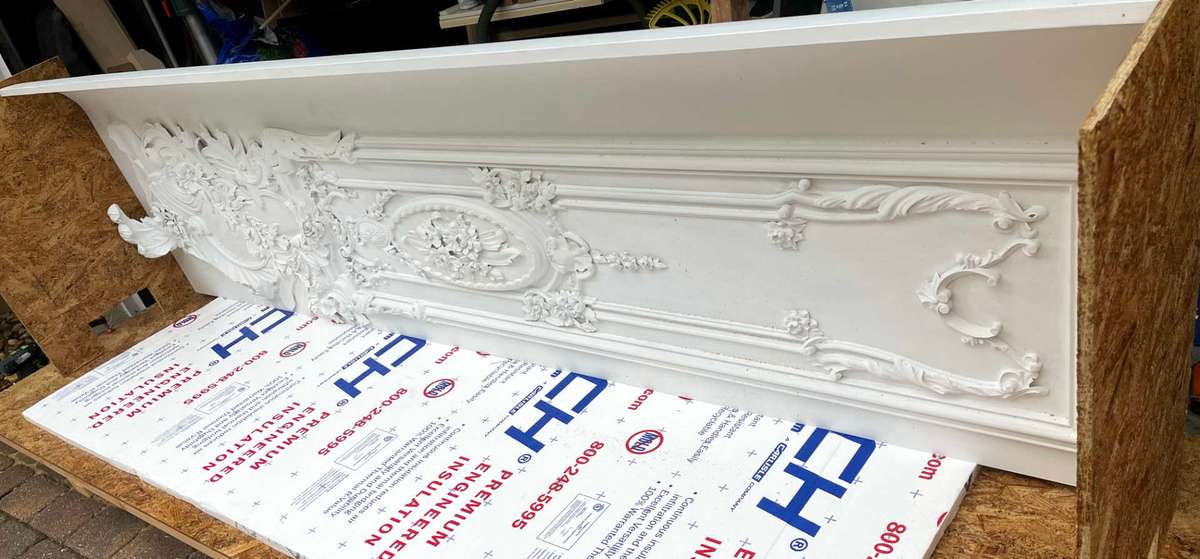
What should a carver know about Louis Quatorze?
Five things carry the whole style, and every one of them is about light rather than detail.
Dates run from 1643 to 1715, and the two signature parts are the scroll and the shell.
Colour is almost absent, so light and shade carry the entire design.
No surface in the details is flat. Everything gets hollowed or rounded.
Symmetry in the masses is what separates this from Louis Quinze.
Once the masses stop being arranged at all, you are looking at Rococo.
What are the parts of Louis Quatorze ornament?
The scroll and the shell, with the anthemion itself turned into a hollow shell. Everything else comes straight out of the Cinquecento with a few new varieties. Those two elements are the fingerprint.
Scrolls come in two states. Sometimes one is plain, a bare volute with a clean rounded back. The other kind wears acanthus foliations, and those foliations are broad, fleshy and short. Hold on to that word broad. It matters in a minute, when we get to Louis Quinze. Wornum also mentions a fiddle-shaped pairing of scrolls that he thinks got left over from ordinary Renaissance work, and then he drops the subject and never comes back to it. Most of the grief carvers get from this style lands on the clothed scroll, and the failures repeat, so I collected them in carved acanthus scroll mistakes.
The shell is stranger. Take the anthemion, that upright fan of leaves the Greeks put on everything, and hollow it until it stops being a fan and becomes a scallop. Ralph Wornum, writing in 1860, put it plainly in his Analysis of Ornament: even the anthemion in these styles becomes a hollow shell.

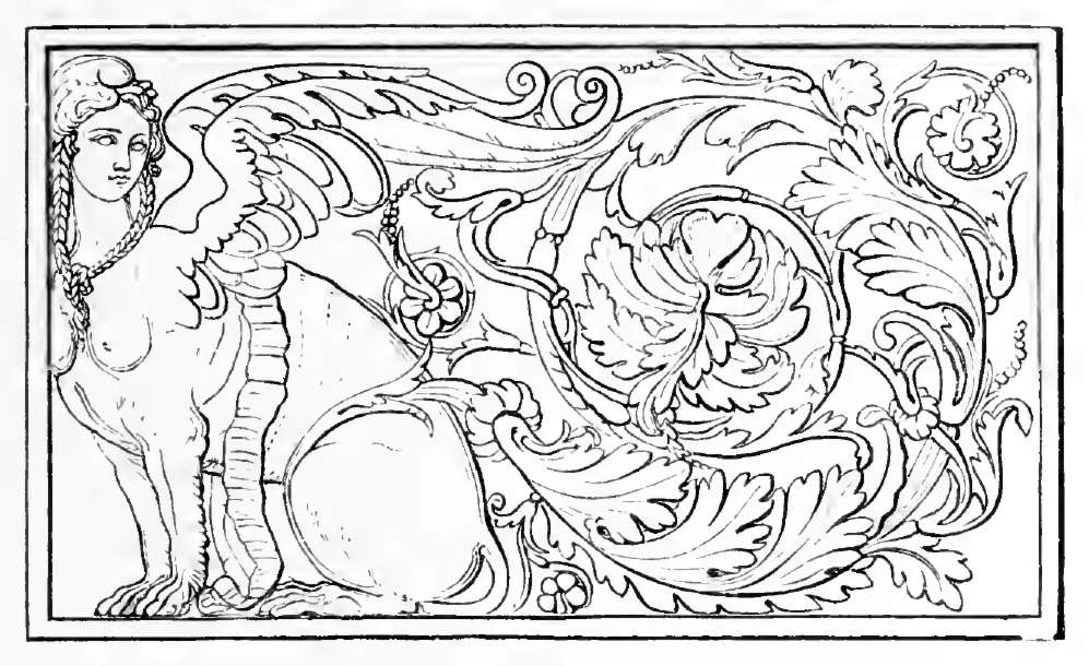
The one full Louis Quatorze plate in the whole book. Scroll and shell together, and if you follow the edges around you will not find a single flat plane anywhere in it.
Italy sent this style to France, not the other way round. Wornum points at the Chiesa del Gesu in Rome as its type, decorated by Giacomo della Porta, Pietro da Cortona and Father Pozzi. France took it, gilded it, and built Versailles out of it. Jean Le Pautre published it in pattern books that carvers across Europe worked from. Claude Ballin made it in silver for the king. Andre-Charles Boulle put the same logic into marquetry. England went a different way in those same years, and you can see how far apart the two ended up in the Grinling Gibbons style.
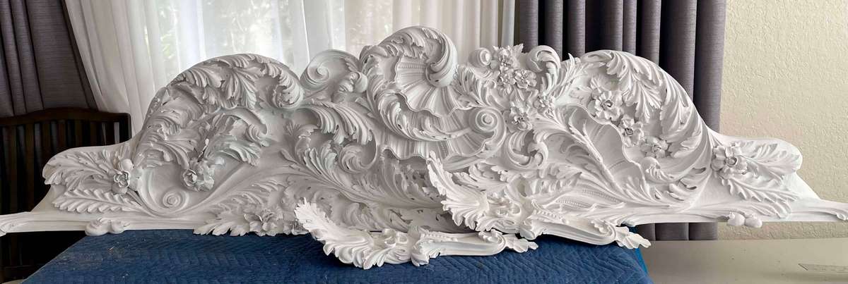
Why is there almost no colour in it?
Gilt stucco was the great medium of the period, and gold laid over gold leaves you nothing to work with except form. Painted decoration got pushed aside almost entirely. Strip the colour out of a scheme and exactly one tool remains.
Think about what that does to a designer. He cannot separate a leaf from its background with a different tint. Nothing gets outlined, and nobody picks out a moulding in red the way the Cinquecento would. Wornum says the chief aim became effect by a brilliant play of light and shade, with colour or mere beauty of form in detail having no part in it whatever.
Hard sentence, and I think it is the most useful one in his whole chapter. Beauty of detail has no part in it. A perfect little leaf, carved beautifully, sitting on a flat plane, contributes nothing at all. This style does not care how nice your leaf is. It cares whether the light moves.
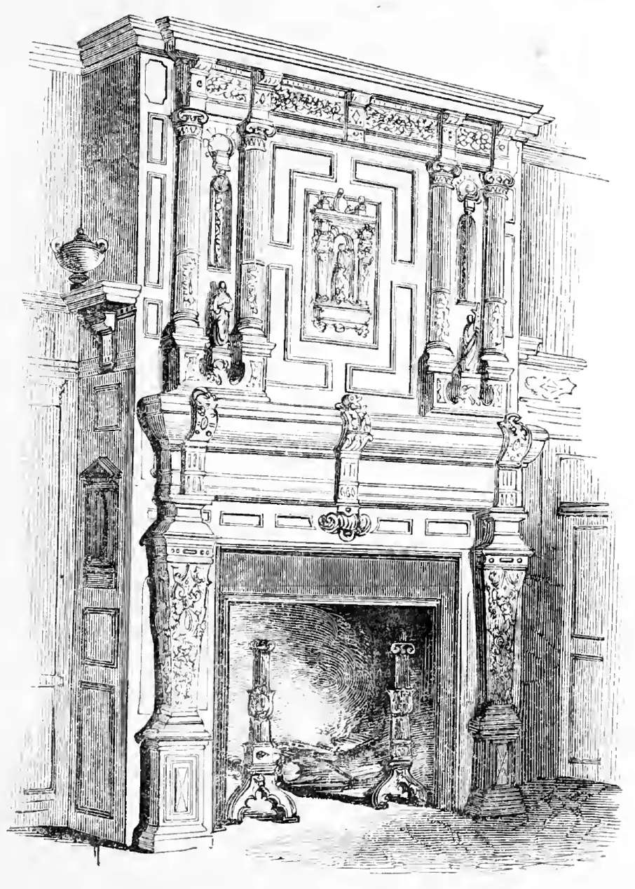
The Cinquecento chimneypiece this style replaced. Beautiful detail, and much of it sits on a flat ground.
Why does my panel look dead under the light?
A panel goes dead when its surfaces are flat, because a flat plane holds one value and holds it all day. Move your head. Try the lamp from the other side, walk across the room, come back tomorrow. Nothing changes. Your eye is reading that stillness as dead.
Have you ever finished a carving that looked good under the bench light and looked like nothing on the wall? Turned it forty five degrees hoping the light would find it? Do you have a panel in the shop right now that you cannot explain to yourself?
Then it is the surface, not the drawing.
Round that same surface and something else happens. Somewhere on the curve there is one line where light bounces straight back at your eye, and it is bright. Right beside it the curve turns away and goes dark. One leaf, one piece of wood, no paint at all, and you have a bright edge and a shadow out of the same cut. Then you move, and the bright line moves with you.
That is the whole style. Not a technique inside the style. The style.
Why is nothing in this style flat?
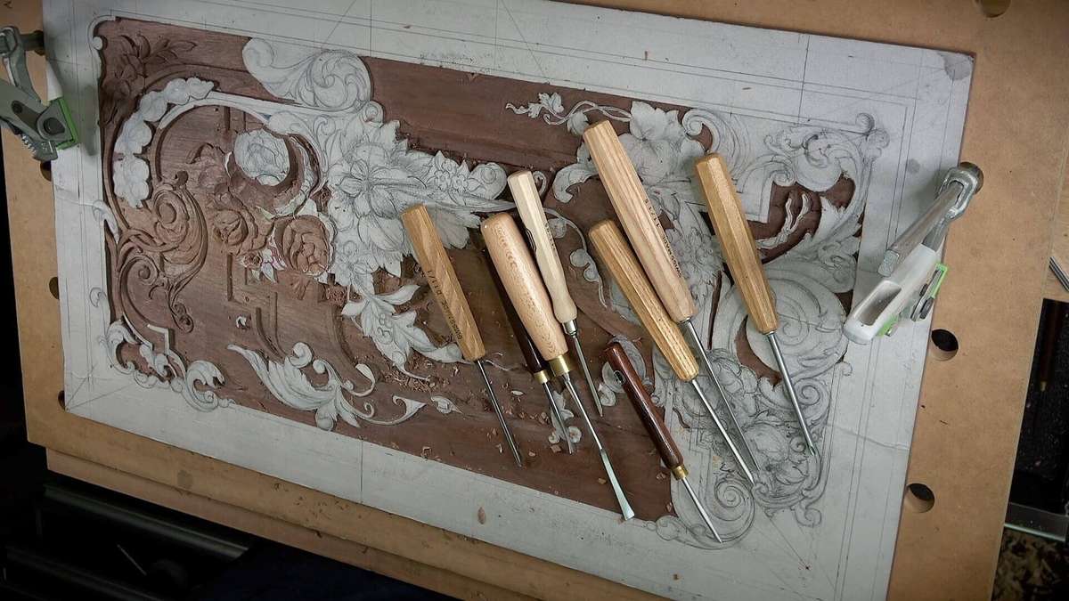
Flat surfaces give no bright line, and the entire style is aimed at contrast of light and shade. Wornum is direct about it. They do not admit flat surfaces in any of their ornamental details, all are concave or convex, perfectly smooth but never flat.
Perfectly smooth but never flat. Read that twice, because those two words fight each other in the hand. Smooth wants sandpaper. Never flat wants a gouge. And sandpaper on a hollow shell rounds over the one crisp edge that was doing the work, which is how a carver sands a Louis Quatorze panel to death while trying to improve it.
He sets it against the Elizabethan on purpose, and the contrast is worth a table.
Louis Quatorze | Elizabethan | |
|---|---|---|
Surface of the details | Concave or convex, smooth, never flat | Flat planes everywhere, even the curved shields read flat |
Symmetry | Held in the masses, sometimes dropped in the details | Held, and echoed again by the repeating strapwork |
Colour | Almost none. Gilt on gilt | Carried by paint, inlay and contrast of material |
Medium | Gilt stucco first, then carved wood and silver | Oak, plaster, strapwork panelling |
Key element | The scroll and the shell | The strap and the lattice |
How it reads across a room | By light and shadow that move as you move | By line and pattern that stay where they are |
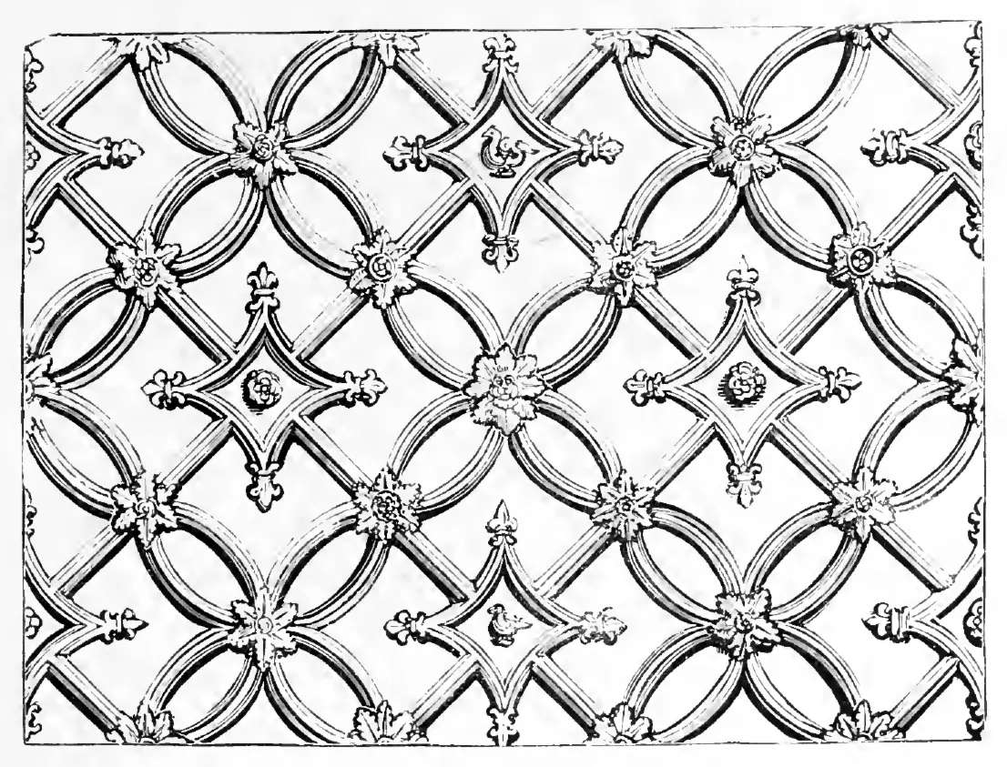
Elizabethan strapwork. Every strap there is a flat plane, and in Louis Quatorze every one of them would be channelled or moulded instead.
Both are good styles. They simply build their pattern out of different material. Elizabethan builds it out of line, which is why it can afford flat planes everywhere and lose nothing at all by it. Light is what the French style builds with, so it cannot. The same question turns up on running work, on every ovolo and cyma you clothe with leaf, and I worked through that case on its own in acanthus over mouldings.
Why does carving deeper make it worse?
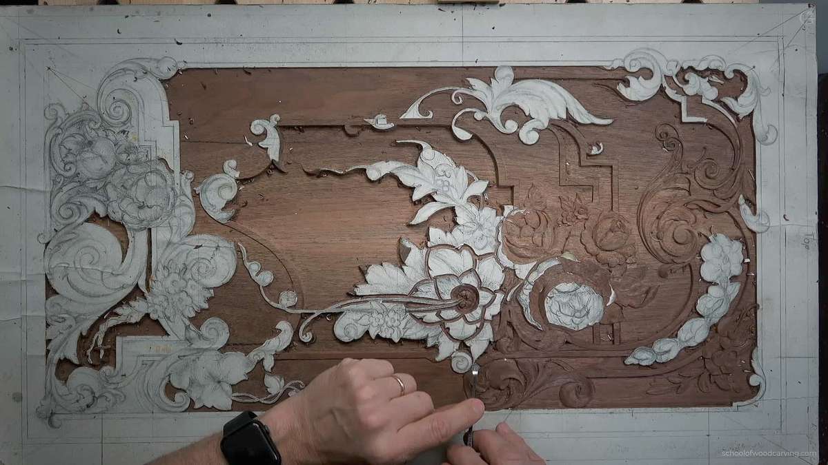
Deeper cuts add shadow, and shadow on its own reads as a hole. This catches a lot of carvers, and it catches them because it feels like the obvious fix. Panel looks flat, so down you go. You drop the ground, you undercut harder, and the thing gets darker and still reads as one shape from across the room.
The bright line does not live down in the hollow. It lives up on the crown of the convex surface, on the rounded back of the scroll, on the swell of the shell just before it turns over. Your eye hunts for that line, and digging never produces it. Rounding does.
So the order of work runs backwards from what most people do. Shape the roundness first and let it stay generous. Cut the ground only as deep as you need to release it.
Here is how I keep those surfaces clean, because smooth but never flat is a sharpening problem as much as a design one.
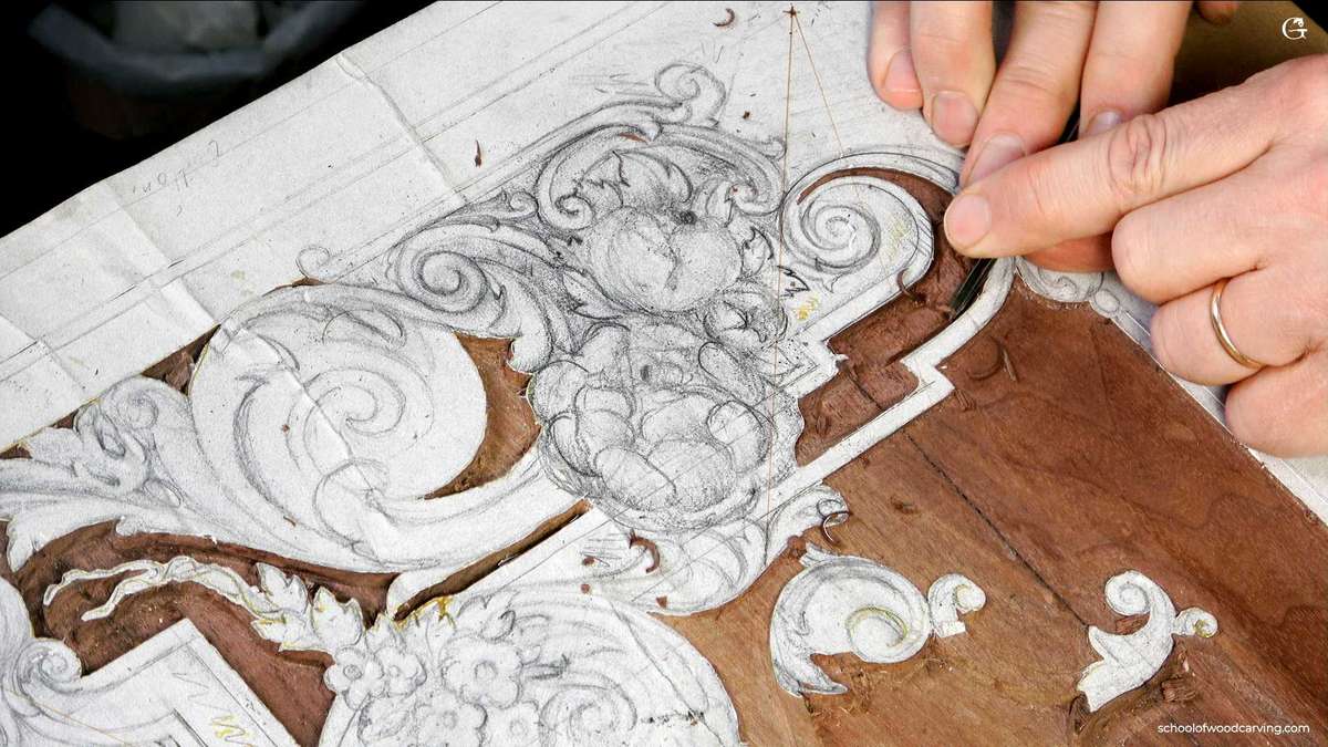
Rough the mass with a #7 or #8, and stop while the form is still fat. Nobody puts wood back on a crown.
Sweep the convex surfaces with a shallow gouge held nearly flat, bevel rubbing, in long slices running the whole length of the form. One long cut catches light evenly. Six short ones catch it in six pieces.
Hollow the shell with a spoon gouge that matches the curve you actually want. Steering a tool through the cut means the sweep is wrong, and the surface will tell on you.
Strop before the last pass, not after it, so the final slice is the sharpest one you take.
Leave the crowns off the tool. Sand the ground if you must, but that faceted gouge finish on the rounded work is not a defect here. It is a hundred small bright points instead of one.
Basswood, Tilia, takes all of this beautifully because it slices in every direction and holds a crisp arris. A 2x4 will fight you on every one of those five steps and blunt your gouge while it does.
What is the difference between Louis XIV and Louis XV?
Symmetry. Louis Quinze drops it, even in the most central and prominent places. The elements barely change. Treatment changes completely, and that alone is enough to make it a separate style.
Its dates run from 1715 to 1774, and its parts no longer come from the Cinquecento. They come from the French schemes of the reign before, so it is a copy of a copy, and the drift away from the original types widens every year.
Watch the acanthus. Remember broad. Wornum tracks it exactly: the broad foliations of the Louis Quatorze scroll become very much elongated in the Louis Quinze, approaching the flag or fleur de lis leaf, and the palm branch. That fleshy short leaf stretches out and thins.
Then symmetry goes. Until this point, a designer dropping symmetry at the centre of a panel would have been told he had made a mistake. Now it is the fashion. Juste Aurele Meissonnier built a career on it. Watteau painted the world it decorated.
Wornum, who clearly did not love the change, gives it one dry line of defence. Since a general play of light and shade was the aim anyway, the style was not much injured by a want of symmetry in details, which were always too vague to hold your attention on their own.
When does it become Rococo?
Once the masses stop being arranged at all. Symmetry in the details goes first, under Louis Quinze. Rococo abandons the balance of the whole thing on top of that, and with nothing arranged there is no design under the ornament any more, only ornament.
Here the shell comes back and takes the name with it. Coquillage. What began as a hollowed anthemion inside a controlled classical scheme ends as the entire vocabulary, piled and curled, with nothing holding it in place.
Then Wornum lands the part that should make any working carver sit up. Louis XV and Rococo were the prevailing English tastes at the Great Exhibition of 1851. In silver, in wood carving, in carpets, in damasks, even in lace. Not because anybody chose it. Because designers did not know the history, so each one copied his neighbour, and a whole trade drifted into the most debased version of a French style and called it taste.
One hundred and seventy five years ago, and the mechanism has not changed. Copy the panel in front of you without knowing what it is doing, and you inherit whatever mistake the man before you made.
What does this style teach a carver?
Surface treatment on its own can carry a design once colour and flat pattern are taken away. Serious lesson, and it travels to work that has nothing to do with France.
Every panel you carve is going to hang somewhere with real light. Not bench light. Window light in the morning and a lamp at night, and somebody walking past who is not thinking about carving at all. A whole generation of designers took that seriously and built an entire vocabulary out of it, and the vocabulary is the style we have been reading all the way down this page.
There is an order in it too. Design, then carving, then sharpening. The first one puts the masses where light can find them. Carving makes them round. Sharpening is what lets the last slice leave a surface clean enough to reflect anything, and of the three it takes the longest to get.
I was sixteen when my master put that in my head, and he said it better than I do. Drawing on paper is not design. What he meant by design was the laws of space and rhythm, repetition, and knowing exactly what a tool will do to wood. He taught me to think like a tool. A style that builds its whole pattern out of light is the hardest test of that idea I have run into, which is why I keep going back to it.
So do the test that costs nothing. Lay the panel flat, walk to the far end of the shop, and look at it from there before you call it finished. Bench light lies to you. Distance does not.
Those laws, the ones that decide where the masses go before you cut anything, are the whole first pillar, and they are what I teach in principles of design in wood carving.
Wornum's book is public domain and free. Read the chapter yourself at Analysis of Ornament, and go look at Versailles while you are at it.
Frequently asked questions
What years is Louis Quatorze ornament?
The Louis Quatorze period runs from 1643 to 1715, the reign of Louis XIV. Its successor, the Louis Quinze, covers 1715 to 1774. Wornum treats the two as distinct styles even though they share most of their elements, because the treatment differs so much.
Is Louis Quatorze the same as Baroque?
Baroque is the family, and the Louis Quatorze style is the French court version of it. Italy produced it first. The Chiesa del Gesu in Rome is the model Wornum points to, so the resemblance to Italian Baroque is real and direct rather than a loose comparison.
What is a coquillage?
Coquillage is the shell motif, and it gives Rococo its other common name. It starts in Louis Quatorze as an anthemion hollowed into a scallop inside a controlled scheme, then grows until it runs the whole design with nothing arranging it.
What wood should I use for a Louis Quatorze panel?
Basswood, also sold as limewood or American lime, is what I reach for. The work demands long clean slices across rounded surfaces in every grain direction, and basswood gives you that without tearing. Construction lumber will tear on the crowns and dull your gouge while it does it.
Why should I not sand a Louis Quatorze surface?
Sanding rounds over the crisp arris where a hollow meets a crown, and that arris is where the light comes back at you. Wornum asks for surfaces that are perfectly smooth but never flat, and a well stropped gouge gives you both. Sandpaper gives you smooth and takes the crispness away with it.
Filed under
- Acanthus Leaf
- Acanthus Leaf
- antique ornament
- Baroque
- Baroque
- carved panel
- Classical Ornament
- decorative arts
- decorative arts
- French ornament
- French ornament
- gilt stucco
- gilt stucco
- light and shadow
- Louis Quatorze
- Louis Quatorze
- Louis XIV
- Louis XIV
- marquetry
- ornamental design
- ornamental design
- Rococo
- Rococo
- scrollwork
- scrollwork
- shell motif
- shell motif
- silverwork
- symmetry
- Versailles
- Versailles
- wood carving
- Wood Carving