

Alexander Grabovetskiy, woodcarver, School of Woodcarving · Published 2020
What does stripey mean in wood carving?
Quick answer: Stripey is my word for a carved surface crowded with lines. In Venice Room 43.5 one spot got a little too stripey, and I didn't think I liked it. Too many ridges, I said. A number three held upside down turned it into a gradual convex feel that was still not flat.
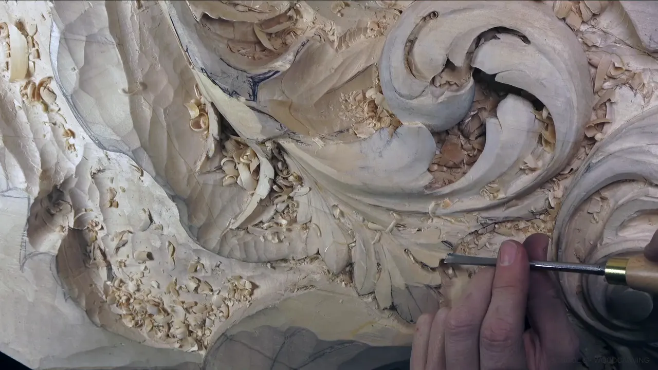

Stripey is my word for a carved surface crowded with lines, and too stripey is a look I don't like. In Venice Room workshop 43, part 5, a spot on my board went that way.
Have you ever carved lines in wood side by side, two hollows next to each other, and then felt the spot go busy? Did the lines between them catch your eye before the leaf did? Then you have met this word already. Part 5 is short, about seven minutes, so most of this page comes from my other courses, where stripey turns up on acanthus leaves, a rosette, a lily box and even in the grain of the wood.
Stripey in seven short lines
- Too stripy means a crowd of lines, as I said on a furniture panel.
- In 43.5 the fix for a stripey spot was a number three turned upside down.
- The bigger tool I took next left a much cleaner surface, and on the lily box a bigger gouge took ridges down.
- On the grape onlay I said tools that are too small leave stripes.
- Shallow work that only shows the movement keeps the overall shape.
- A few stripes can stay when the eye follows them, as on one rosette.
- Butternut, oak and sometimes walnut bring stripes of their own, in the grain, before any tool touches them.
What went too stripey on the board in 43.5?
The part opens on a plan. To create the shape I was after, I needed to lower one spot a little more, probably, and then, I said, it would make sense. I named a number seven for it. With the tool in the wood I said, "And yes, I'm cutting against the grain, which is not always the best idea."
Next I needed a bigger concave in that area, and that way I could raise the middle part a little bit, so I picked a small number seven. "I'm not going to touch the edge, but it's becoming weak, so I have to be careful what I'm doing." The careful part I said twice.

A choice about depth came up at 01:43, and I said it in two short lines. "I could go a little deeper right here. Not sure if I should or not." I definitely could, I said, but the question was if I should. My plan was another concave, going that way, because I didn't want too weak of a spot right there.
Then, at 02:21: "But on the other hand, that's a little too stripey now, and I don't think I like it." Two short verdicts came after it. "Too many ridges. Doesn't look too good."
How did a number three held upside down take the ridges away?
Four seconds after that verdict I said, "Let me use upside down number three." Then: "And here you go. I was able to create that convex feel gradually, but still it's not flat because I really didn't want to see a flat movement."

The convex came gradually, and it stayed off flat. The tool I had in my hand after that was a little too small. "Maybe I should use a bigger one and clean a little nicer right here," I said, and then, "See, a bigger tool gives me a much more cleaner surface." I can always move this way and blend, I added, and said blend a second time.

"And nothing stops me from creating final details," I said at 03:51, and a little later, shorter, "Nothing stops me from final details."
Why look at a stripey spot from every position?
One view can fool you. "I have to check from all the positions because it has to make sense," I said at 04:21. And then: "Sometimes it looks good from a certain point of view, but when you look from the side, it doesn't look good."

I changed a design on the spot in the Venice Room, workshop 93, part 6. "I think it's just too many stripes right here," I said, and my plan was to make that piece part of one section. If you ask me why I change, it's because I look from different points of view, and if I don't like some stuff and it's not too late to change it, I would change it until I like it.

Do small tools make carving lines in wood look stripey?
They can. I said on the grape onlay, lesson 3, that I don't like to use too small a tool in a case like that, because it gives me a real stripe result. Still, some areas need a smaller one, because you cannot reach them with the bigger tool.

My modern acanthus course, lesson 8, carved from a 1903 design, has the same warning about a micro pipe. I said I was not going to use a small tool for it, because a small tool would create a stripy look, "which is not gonna look nice." Then I asked if you could catch that micro pipe on the camera, and said maybe I would just turn the lights off so you could see the shadow.
Going bigger works the other way. In the lily box lesson on the second layer I said, "And if it is too stripey for you, you can always take a bigger gouge, kind of remove some of the ridges." I did it right there, exactly the same, from the middle line going outward, and then it looked finished.

Is a stripey acanthus leaf wrong?
For me it is a matter of taste. In lesson 8 of the modern acanthus course I asked you straight out: "Please do not put stripes. I don't like stripy acanthus." Those lines I don't like, I said, and personally they just look not natural to my eyes. Even so, it's okay, and a lot of people are doing it.
What I would take there instead is a flatter tool, maybe a number seven, 14 millimeters (about 9/16 in). With it the pipe gets just a hint, one small concave. That concave I don't have to carry all the way, I said.

Books on acanthus show the other road. In my Byzantine acanthus course, lesson 5, I said that on a furniture style, low relief acanthus in those books you often see stripes, multiple stripes on the side. Byzantine carvers didn't do that, and the reason I gave was the gold. A Byzantine acanthus leaf, I said, was always gold leaf, and those channels made a big problem for gilding back then, when the leaf was a little thicker than it is now.
I kept the first concaves shallow in lesson 10 of that course. Don't get too deep cuts, it's just indication of the movement, "because we don't want to lose overall shape, otherwise it's going to be too stripey, and I don't like too stripey."
When are a few stripes fine?
When the eye can follow them. The Venetian flowers rosette, lesson 4, had some long cuts in already, and I thought maybe I could get another one right inside, so that, visually, it would catch the eye and you could just follow the movement. "I know it looks a little stripy, but if you look in overall picture," I said.

The plan for the other side, in lesson 5, was the same idea. "I'm going to put a couple stripes," clean it a little bit, with not too many details on it.
Stripes can be the texture, too. One part of a Byzantine leaf in lesson 10 stayed flat because that's where the glue would go. For the rest I planned a texture, and said you can do it with a number nine, a small one or a bigger one, it's up to you, or even a number seven. "I want to just run across some stripes, some cuts," I said. Something happened at one end, and my advice was to attack from the edge toward the inside, otherwise it catches the edge, the grain, then rotate and attack from the opposite side.
Which fixes take a stripey spot down?
Seven spots from seven lessons, with what I did or planned at each one.
| Where it was | What looked stripey, or could have looked stripey | What I did there |
|---|---|---|
| Venice Room 43.5 | Ridges standing on one spot of the leaf | #3 turned upside down |
| Furniture panel 19 | Movements I liked, but not how they looked | Made it slightly softer |
| Venice workshop 156 | The middle section, maybe too stripey, I said | Maybe one single concave |
| Workshop 93, Venice | Stripes right there in one spot, I thought | Planned one section instead |
| Lily box 9.4 | The second layer, if it looked too stripey | A bigger gouge, outward |
| Venice Room 28.6 | A slight concave the spot almost asked for | Left alone for now |
| Furniture panel 36 | Details I did not want to overdo there | Just blending, and gradual |
Workshop 156 of the Venice Room left the single concave a maybe in my words. "But that's also legit," I said, and soon after I could see it creating a beautiful shadow, and I was happy with that. For the other side I planned to start with two millimeters (about 5/64 in) again.

Can the wood itself look stripey?
Grain can do it before a gouge even touches the board. During a livestream in April 2020 I said I love butternut, and the only thing I don't like about it is the grain. If you're working on really big movements and you just see stripes, too many of them, I said, and butternut does have a pronounced grain, that would not be too nice. Without movements like that, with a lot of details, it's a really great wood. In Pennsylvania, Ohio or Indiana you're still able to get it. Down in the southern states it's almost impossible.
In workshop 52 of the Venice Room I named oak, and even sometimes walnut, as wood where a lot of grain just distracts. Stripes, and lines, too many of them, I said, and it doesn't look too good.
The grain of the wood on the lily box, lesson 12, was itself kinda stripy. So I didn't want to put too many concave lines on the side, because I really don't need to create extra stripes.
The word came out once about steel. Testing a set of Schaaf tools for my tools course, I said you can see a lot more rougher stripes on the metal, like machine marks. I wasn't sure that was a proper word to say, but it's true.
How do I keep a leaf from going stripey while I carve?
Shallow first. I kept one spot in workshop 90 of the Venice Room not really deep: "I don't want to make it too stripey. All I need is just pretty much an indication of the movement." At 01:46 I wanted a deeper cut there and asked myself if I really wanted it. I didn't think so. I planned a concave cut instead, but not as deep.

A spot in workshop 28 almost asked me for just a slight concave on one side. I didn't have to. Maybe yes, maybe no, I said, and I left it alone for now, or else it would be too stripy.
How you hold the tool comes into it. Lesson 35 of the furniture panel is where I asked you to pay attention to how I hold my tool. The flute is up at the beginning, and by the end of the pass it has turned to about 10 o'clock or so, but "I don't wanna create too many stripes." It's all about the shadows, I said.
Softening helps. Back in lesson 19 of the furniture panel, a spot was just too stripey for my taste. I really liked the movements. But I didn't like how it looked, and how it felt, I should say. So I softened it a little bit, just slightly softer, and for me it looked much better.

Lesson 36 ended on the same point. All it was going to take was blending, pretty much. Overdo those details and it gets too stripy, I said. It has to be gradual.
And on lesson 21 I worried out loud. I was worried about how stripy it would look, but it didn't, I said. What I'm talking about, I said, are too many lines. Just before that I talked about control. I'm not moving the tool, I'm actually moving the whole body with the tool.

What came after the stripes in 43.5?
After the side check I said, "And let me take this out." Then, at 05:11: "And that is really, really nice detail. I think I love it." Nice and gradual, I added.

The last job was to finalize the inside. "There's going to be a separation or division, whatever is the best to call it." I needed to clean it. Just too much, too messy, I said, and I said too messy twice.

Then a spot that goes all the way along, where I could do a division like that. "So that will make sense." A little deeper after that. The part closes on an honest line: "It's not final detail, final, but at least it's going to give me an idea the direction I'm going because I still have to clean on inside and so on."

Is there a spot on your own board with more lines than leaf? Do you have a number three in the drawer? Then you already hold the tool I turned over in 43.5.
Part 5 sits inside the lesson 43 page, and the Venice Room course for workshops 38 to 49 holds all twelve workshops of this wood carving board. Tuition opens every part, so you can watch the number three go in upside down on your own screen. For all my courses in one place, start here.
How it's done
- Count the lines. On a furniture panel I said that by too stripy I mean a crowd of lines.
- Check it from the side. A spot can look good from one point of view and bad from another, so in 43.5 I said I have to check from all the positions.
- Turn a number three over. On that spot an upside down number three gave me a convex that was not flat.
- Go bigger to clean. In 43.5 a bigger tool left me a cleaner surface. I took a bigger gouge to the ridges on the lily box, from the middle line outward.
- Stay shallow. Too stripey was not what I wanted in Venice Room 90, so I kept that spot not really deep.
Frequently asked questions
Is stripey the same as a ridge?
Close, but not the same. A ridge is a single line, and stripey is the look of too many. In 43.5 I first called the spot too stripey, then named the ridges, and on a furniture panel I said that what I'm talking about is too many lines.
Can a #3 gouge fix a stripey spot?
One did, in workshop 43 of the Venice Room. I held a number three upside down and got a convex feel, gradually, still not flat. A flat movement was not what I wanted to see there, and after it, a bigger tool gave me a much cleaner surface.
Do I ever carve stripes on purpose?
For a Byzantine leaf I planned a texture and said I wanted to just run across some stripes, some cuts, with a number nine or even a number seven. On a Venetian rosette I said one spot looked a little stripy, but asked you to look at the overall picture.
What to carve next