

Alexander Grabovetskiy, woodcarver, School of Woodcarving · Published 2020
What makes a wood carving look rich?
Quick answer: A rich look is what more curls, more divisions and deep shadow give a carving, in my words on camera. Venice Room 41.3 has me saying it after the curls of Venice. Other lessons add a hole that casts shadow on two sides, darker color from the wood, and stain or gold.
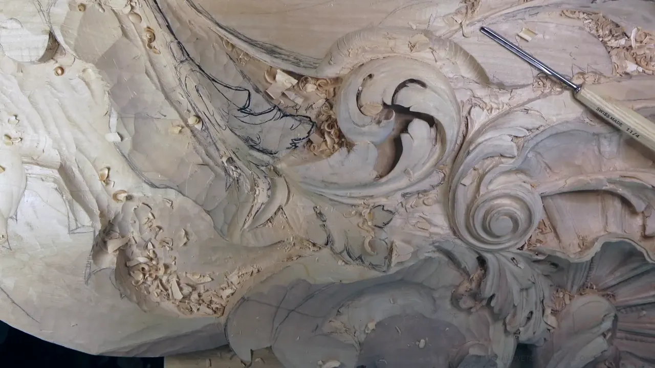

A rich look is my word for a carving that looks full and deep, from more curls, more divisions, a hole that throws shadow from two sides, and sometimes a darker color in the wood. It came out in Venice Room workshop 41, part 3, right after I talked about the curls they loved in Venice: "And yes, honestly, it looks rich."
Have you ever looked at an old carving and felt it was full of life before you could say why? Did one leaf with three curls catch your eye more than a plain one beside it? You already know the look I mean. This part is short, 450 words of talk, so most of this page comes from my other lessons, where I used the same word and said what earned it.
Seven places the word rich turns up
- Curls on a detail, as the carvers in Venice loved them.
- More divisions in a leaf.
- Every pass sent into one hole for a two-sided shadow.
- Small pieces left showing from underneath.
- A leaf freed from its background until it looks applied, the way my furniture panel shows it.
- Darker color from old limewood, end grain, a stain or gold.
- The classical houses of really rich clients.
What did I call rich in Venice Room 41.3?
A detail on the ceiling board. My plan at the very start of the part was to give it some curliness, and then I said where the idea came from. It was regional, those people in Venice, probably one of the things I found while researching. "They really love those curls. Everything was curly." Then came the line this page is built on.
A few seconds later I doubted myself. Maybe I got those divisions in too early, because I still had to excavate quite a lot. I took a number seven for that, approximately half an inch, 14 millimeters to be exact.

Next the plan was to get a little closer to the final outline. I had to get this part somewhat deeper, so the concave could really stand out later on. And I really need to show that roundness to this detail, I said.
There were a couple ways I could do that concave. Probably number 11 again, about 18 millimeters, closer to three-quarter of an inch, a little less. I'd go sideways with it, leaning a little more to the right, and then up.

That part needed to go down too, of course. One spot needed chipping down a little more, but not much, because I still had to make it blend better, and another part was actually really good. Another spot did not look too good, so I said to knock it down, with the same number seven or a bigger one. "But that's okay. That's going to work also."

Then a small tool, number 11 and 4 millimeters (about 5/32 in). "See how it develops?" It raises up a ridge, which is what I'm after. A spoon would probably do the next bit, I said, or the same number 11, a little deeper even.
Near the end the gouge started to leave some trail, and I said I need to sharpen it. I showed the inside with 3,000 grit sandpaper wrapped around a bit of wood, until I could feel a little bit of burr. The next step, I said, would be the leather. That's sharpening, so I'll stop.

Why were the Venice carvers so fond of curls?
I can only give you what I said on camera, and in this part I didn't name a book or a building as the source. So I won't make one up here.
On this board the curls sit on acanthus leaves and on rolled volutes, like the ones in the first photo. What matters for you is the word that came after them. Every other clip on this page is a place where the same word came up, with what brought it on.
Does dividing a leaf more make it look richer?
One spot in Venice Room 68, part 12, didn't make me happy yet. I was still going to divide it into multiple divisions, so it would look a lot more richer, I would say. Maybe a concave all the way, but maybe not. Let me leave it like that for now, I said, and we'll see.
Maybe a cleaner pass with the bigger number 11, 15 millimeters (a little under 5/8 in), came next as a thought. Two minutes on, all those concaves and convex were one thing to me, dividing more and more and more. "It's all about divisions."

Back in Venice Room 32, part 10, the same idea came as a maybe. One movement needed maybe to be widened, and I could divide it a little more. That would give me a much more richer look, I'd say. A bit later came the idea of a really small extra detail, just to give even more detailed look. Why not? If I don't like it, I can always chop it out.

The tiny version is in Venice Room 11, part 5, with tinier separations and small concaves, and a number five in my hand. I counted them out loud, one, then the same right here, two. If you would ask me if it makes a difference, I think it will. It will give an even richer look, in my opinion, and every little concave gives the beautiful movement.

How does a deep hole give a rich shadow?
The hole comes from Venice Room 54, part 3. One tool was a little too big, so I said let me use the 4 millimeters (about 5/32 in), and go carefully. Everything is supposed to go to the same hole. That's going to give me so rich shadow, I said. A simple hole would not do it, since this one is going to cast a shadow from both sides, from this side and from the right-hand side.

Part 7 of Venice Room 63 has me going uphill to make it really deep and nice. Really good excavation, and I was really happy about that. You may not see it too well, but it's just really rich and deep shadow.

A doubt comes up in Venice Room 71, part 4. I wasn't sure if I should do one extra small detail. I decided I would, and if I didn't like it, I could always get rid of the extra detail. Just because I'd done what I'd done, it gave me a lot more chance at a deeper and nicer shadow in that area. It's going to be a much deeper, richer, I would say, shadow.
Next came a plan for a little bigger tool, 7 millimeters (about 9/32 in), and maybe some persuasion with the mallet. A minute later, the warning. I have to keep an eye on how deep I'm going. It would be a huge mistake to go too deep.

The Furniture Panel course, lesson 19, part 10, shows the background side of it. With a number three I could kind of hook it out, and you could see it just coming out. Now it looks like this leaf is applied. And that's much richer shadow.

Can a small piece from underneath fill the space?
Workshop 84 of the Venice Room, part 2, starts with a plan: I'm not going to go all the way. I'd left some small pieces on a previous one, like they're sticking from underneath, and I planned some of the same here. It makes it more richer and fills the space. So maybe some spots, I'll leave it like that. We'll see.
Then I wanted a deeper pass in one section, maybe a little deeper still, about six millimeters or so, about quarter inch. Next came a leaf, and where it would grow from.

Does the overall movement come before the rich look?
Venice Room 61, part 3, opens with a note about the view. One part of the board is on the flat and another is already going on the ceiling, so it looks shrinked, not the real-life view. But you should catch the overall movement, I said. It should be already visible. That will bring beautiful detail richness, I said. It's going to give me a rich look.
Half a minute later I caught the stem with my tool, and I called it a mistake I shouldn't make. Got to be more careful.

Richness comes up again in Venice Room 58, part 8, during an excavation going up, with a lot less pressure. This movement is going to bring me richness, I said. Then, oops. See? I can't do that. I said I had to switch to much smaller tools, because if I would push too hard, that would be a big mistake. So it's better to be patient and take time.
Where does the color of the wood come into a rich look?
Wood can do part of it. In the Hashemi Flowers course, lesson 1, part 5, I had a beautiful piece of limewood with some kind of darker color. I'd had it for a long time, over 10 years, I believe, and it develops a really rich, darker, almost pinkish color. If I can say pinkish. But it is somewhat pinkish.

Hashemi Flowers 44, part 3, gets it from the grain. I really like this piece of wood, and just because it's end grain, it also creates that dark, richer color.
A beginner project has it too. On the curly kitchen cutting board, I left the inside a little more wet with the stain, since we did not sand anything. I'm not afraid my grain is going to be raised, I said, but the color inside is going to develop a little richer. A natural stain, absolutely food safe.
A carving in Venice Room 65, part 7, got no stain at all, nothing on it. Because I know how to attack and how to play with the shadows and light, I could get that look just by pure carving. Yes, with the stains you can get an even richer look, and near the last workshops of my Bible box project I show how I blend everything and exaggerate the shadows.

Gold is the old way. In Roman Acanthus 16, part 2, I talked about Orthodox churches, Greek Orthodox or Russian Orthodox, with a lot of acanthus movement inside. The main idea, especially in ancient times, was to make it as rich look as possible, and they did it with gold leaf. Before the gold, I said, they covered the carving with red clay, where nowadays we use just gesso. The gold needs a really smooth transition in an area like this to stick.

Sometimes the color is still a plan, as on the vase with grape leaves, where I called the design simple but really rich and said we're going to have different colors on it, which is going to look awesome.
Is an ornate wood carving the same as a rich one?
People type ornate wood carving into a search box. On this page the word is rich, because that's the one I said on camera, and I tied it to a kind of house. In lesson 4 of Principles of Design in Wood Carving, I said I work for some really rich clients, and not just the millionaires.
When you go in the house, it's always classical, in my words there. You will find columns and arches over 2,500 years old, and some Corinthian capital. "So everything about richness and Harmony always been Classical." A condo on the ocean where they spend one week can be modern and shiny. But the place they live is classical. Maybe I didn't see all of the houses, but I saw a lot.
How the rich look adds up, lesson by lesson
Here are seven of the clips in one table, each with what gave the look and the words I used.
| Where | What gave it the rich look, in plain words | My words on camera |
|---|---|---|
| Workshop 41, part 3 | Curls on a detail, the way Venice loved them | It looks rich |
| Venice 68, part 12 | One part split into many more divisions, as a plan | A lot more richer |
| Venice 54, part 3 | Every pass sent down into the same hole | So rich shadow |
| Lesson 84, part 2 | Small pieces left showing from underneath, maybe in some spots | Fills the space |
| Furniture Panel 19 | Waste hooked out with a number three | Much richer shadow |
| Hashemi Flowers 44 | End grain, on wood I really like | Dark, richer color |
| Roman Acanthus 16 | Gold leaf in old Orthodox churches, as I told it | As rich look as possible |
Three rows hold plans: the curliness in workshop 41, the divisions in 68 and the small pieces in 84, which I said I'd maybe leave in some spots. The gold leaf row is history as I told it, and in that clip no gold goes on my own carving.
Which one will you try on your bench?
Is there a leaf on your bench that looks a little flat? Could it take another division, or a hole that goes dark on two sides? Each of those is on camera in the lessons linked above.
Part 3 of workshop 41 sits on the lesson 41 page with the rest of that day, and the Venice Room course for workshops 38 to 49 holds the whole ceiling. For all my lessons in one place, start here.
How it's done
- Plan the curls. At the start of 41.3 my plan was to give one detail some curliness, the way they loved it in Venice.
- Divide one part more. My plan in Venice Room 68 was to divide one part into multiple divisions, for a richer look.
- Send it all to one hole. Everything is supposed to go to the same hole, I said in workshop 54, so the shadow comes from two sides.
- Hook out the waste. A number three hooked it out on the furniture panel, and the leaf looked applied.
- Watch the depth. In workshop 71 I warned against going too deep.
Frequently asked questions
Did the carvers in Venice put curls on everything?
In 41.3 I said it was regional, one of the things I found while researching. They really love those curls, everything was curly. I named no book or building there, so I only give you my own words from that part.
Do you need a stain for a rich look?
On one Venice Room carving I used none and got the look from shadow and light alone. With a stain, I said, the look can get richer still. The color inside would develop a little richer under the stain, I said of a beginner cutting board.
Which gouge was planned for the concave in 41.3?
Probably number 11 again, I said, about 18 millimeters, closer to three-quarter of an inch, a little less. I planned to go sideways, leaning a little more to the right, and then up. Later a smaller number 11 raised up a ridge.
What to carve next