

Alexander Grabovetskiy, woodcarver, School of Woodcarving · Published 2020
What does "appealing" mean when a wood carver says it?
Quick answer: Appealing, in my carving, is how a shape looks to the eye. Venice Room 48.11 had a half-carved curl that didn't look that way yet, and I said it will be. On other pieces the same word came right before I said a part needed blending, lowering or raising, and where people stand to look counts too.
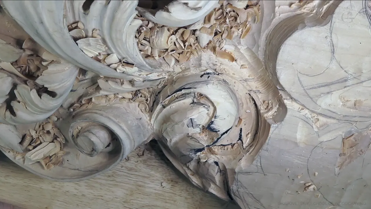

Appealing is my word for how a carved shape looks to the eye, and whether I like what I see yet. In Venice Room 48, part 11, I looked over a half-carved curl of acanthus and said it was somewhat what I want to see. Then I said it straight. I know it just doesn't look yet too appealing, but it will be. Other times the same word comes right before a fix.
Have you stopped halfway through a carving because the shape looked worse than the block did? Did you wonder if that look meant you did it wrong? Learn the two ways I use this word, and you'll know which one you're facing.
Part 11 runs about seven and a half minutes. So I put other lessons next to it where I said appealing, or not appealing, on camera. Each one is named, and each has a link to its own page.
Five things I mean when I say appealing
- Not appealing yet, in the rough stage, means keep going.
- A real cause, like a side that sits too high, means a fix now.
- Where you stand matters. A board for a ceiling can look less appealing on camera and good from below.
- A gradual curve throws more shadow.
- Some of it comes before any carving, from the rules of design on paper.
What happens in part 11 before I say it?

The part opens on a second separation. The piece next to it would sit a little above, so I said I need to undercut. Right there I wanted a somewhat deep excavation, because I really wanted to show it. A shadow point, I said. A really interesting excavation.

Next, that spot would be an eye. Because it is an eye, I said I need to bring this movement, and then I took it back. Actually, I don't have to, but I could bring that movement a little inside. Maybe I'll do that, just slightly, I said, and that stayed a plan right there.

There's a second separation right here, I said. Number 11 and 4 mm (about 5/32 in), that's what I'm using. A deep shadow spot, I said, twice.

A part nearby could go underneath, even where I had drawn the line. My thought was I could take this all the way inside, underneath. Then just a little cleaning. And I said I've got really good movement going on.

Another separation was coming. I would need to chop this way and give the main shape, and outline it. No undercutting there yet, because I still wasn't sure if I would go deeper or not. For now, just a little bit, to get the right shape. The right form. Really three-dimensional, I said. Beautiful.

That would be the last movement, I said, with its point right there, then another division and another eye. I apologized that you don't see it. I need a bigger one, I said next, just to get rid of that chunk. Because it's an eye, this part has to go underneath. And probably a little deeper concave again.
Why does a half-carved shape not look appealing yet?

A half-carved shape is still simple. In part 11 I said that is the center, three times in a row, and now I can work on details with no problem. You should be able to see already it's taking shape. Not bad at all. Yeah, it's still simple, but that's why I'm working at it.

My plan at the end of the part was another concave, and not too deep. Maybe number seven will be sufficient, I said. A plan, out loud. The part ends there.
Back in Venice Room 8 I said nearly the same thing. It's not that appealing yet, I said. It'll be okay, it will be fine. What I wanted next was a few more separations, to give it some curliness almost.
A pipe had just gone in when I said it again, in Venice Room 121. Doesn't look appealing yet, I know. It will, it will. One workshop earlier, in Venice Room 120, I carved something I didn't have to do in every area, because I think it just adds some more interest. It didn't look appealing at the beginning, I said, but once everything is cleaned and the extra material is removed, it'll look awesome.
Sometimes the reason is plain. On the furniture panel, a paper was still on top of one detail, so it didn't look as good. Even so, I could see my movement needed a fix. That's a law of flow, I said in Furniture Panel 20. Everything is supposed to have a nice flow.
When does not appealing mean fix it now?

When the problem is the shape itself and the stage won't fix it. One side of the Lily Box 4 carving I wanted to round even more, with a fillet. Right now it's too high, I said, and it won't look appealing, won't look good. So I had to take care of it, the whole side, and the same number three went in carefully.
A ridge did the same in Lily Box 7. It doesn't look appealing, I need to blend that, and I blended it with a small number three, a quarter inch (about 6 mm). A little later I was kind of happy with the overall movement. Then a small concave would help me a lot, I said, because visually it would look more appealing, and the tool I named for it was a number eight of 3/32 in (about 2.4 mm).

A wall can fail the test too. On that same box, in Lily Box 6, a wall looked too rough, so the plan was maybe a number three, about 5 mm, 3/16 of an inch, both figures mine, to clean it. Over in Roman acanthus lesson 16 I kind of liked one detail, and then came a wall that was not appealing at all. Let me use number seven and half an inch (about 13 mm), I said. Try first this one. Probably a little too small, and a bigger one could go in if it would fit.
On one Venice board, Venice Room 152, I needed to fix the overall shape. If you look at it, not too appealing. Almost like a straight line in that section, and next to the tool itself that line just didn't look too good. So let me do a division right away, I said, and that way I'll fix that problem. Should I or should not? I don't know yet, so I'm kind of having doubts.
Sometimes the fix runs the other way. Establishing some shapes was really important for me in Venice Room 55, and right now it just doesn't look too appealing to me, I said, so I need to raise this part.
| Lesson | What did not look appealing | What I did or said next |
|---|---|---|
| Workshop 48.11 | One section around its center, still simple, half carved | It will be, I said |
| Lily Box 4 | One side sitting too high, still to be rounded | Take care of the whole side |
| Lily Box 7 | A ridge on the second layer of the box | Blend it with a small three |
| Venice 152 | A section reading almost like a straight line | A division right away, then doubts |
| Roman leaf 16 | A wall that came right after a detail I liked | Number seven, half an inch, first |
| Venice 59 | A curved gouge pass that cast too straight a shadow | Maybe a seven, or my light |
| Panel design 14 | A point that fell approximately in the middle | Six of ten, downhill |
Does appealing depend on where you look from?

Very much, on a board that goes up on a ceiling. In Venice Room 19 I asked you to understand something. From the camera perspective, it doesn't look as appealing sometimes, because you are looking from this side, which is not the right side. It does look good from the bottom, and from the front. A little later I said it again about a section seen from above.
I check that myself. A spot in Venice Room 12 was actually looking really good from the bottom. Looking straight on, I didn't find it too appealing, but from below it looked okay. I still thought I probably had to break it slightly, because even a small number 5 gave me just too sharp of a look.
From the side counts too. One section was already high in Venice Room 148, and from the side I didn't like how it looked. I really want to lower that down, I said, maybe make the twist a little wider, so from above it wraps into a fuller volute. It does not make sense yet, I told you. My plan, and I thought it would look better.

Above is another angle. Looking at a background leaf from above in Hashemi Flowers 11, it didn't look too appealing to me, and it lacked some details. It would sit below my flowers, more or less like an acanthus. Every acanthus leaf has to have an eye and a pipe, I said, and I believe right there was an excellent spot to put an eye and just get that pipe.
What does shadow have to do with appealing?

A lot, the way I carve. While I blended one side of a pipe in Acanthus over Moldings 3, I said that where there's an eye, it has to go gradually, not a straight line down and not raising up. More appealing, I think, because it creates more shadow play. You know the logic of shadow. In a three-dimensional world, a concave gives you shadow, and it depends how the light will hit even a slight concave.
Venice Room 59 went the other way. I still didn't like how sharp one area looked in that workshop. It wasn't appealing, and the shadow was the reason. The shadow is too straight, I said, and I had no idea why, because I did have a curved cut there. It casts a wrong shadow, so I had to fix it. Maybe a number seven of 14 mm (about 9/16 in) for a little more pronounced arc, I'll try first. But it could be just my light. Then, on the other hand, I think it actually looks better, I said.
Part 11 is the same idea in small, with the excavation I wanted to show and the deep shadow spot I named right after the second separation.
Can a design look appealing before any carving?

With rules, it can. In Furniture Panel 2, the design course, I worked out the space at a border with Fibonacci. If one is 10 mm (0.39 in), then 10 plus 10 is 20, which is 3/4 of an inch, I said, and that's why I left about 3/4 of an inch of space. I think it'll be just a more appealing-looking one to the eye. I don't know how it works. But the whole universe, I think, is actually created like this, and you can find those rules, those principles, those laws almost everywhere in all the creation.
In the next part I said it from the other side. When you follow those rules, your artwork is actually looking really good. Inside your brain, probably you're wired that way. Pleasing to your eye, appealing to your brain. Later in that part I talked about finding the position of those golden centers, or focal points.
A point fell approximately in the middle in Furniture Panel 14. I needed to move it this direction or that direction and find my six parts out of 10, and I'd rather move it downhill. Those are the secrets of the design, pretty much, I said. I could leave it in the middle, but it won't be as appealing to the eyes.
How do you make a first carving more appealing?

Refine it after the first cuts are in. Workshop 2 of the First Cuts for Beginners course has a stretch of just right, left and straight down cuts, following the design lines. And later on, just refine, for a more appealing look. In the next part I refined one element with the low angle, to make it a little more appealing, or nicer looking. The result was not bad at all, and it was a quick design.
A line can do it. For one downhill movement in Lily Box 8, I could give that effect an even more appealing look. I could create a small line cut there, I said, almost from nothing to deeper, and let me use maybe 1 mm (about 0.04 in). Almost like scratching first.
Part 4 has two more. A number one back bent would help me a lot, I said in Venice Room 38, and then I needed a little bigger one, like 10 mm (about 0.4 in), still absolutely flat like a chisel. The idea was just to make a part more round and more appealing looking, and that undercuts right away, pretty much. Something sat on the same line in Venice Room 45 and didn't create the flow, and even the position of the point makes the big difference, I said. It's just like an invisible arc, I said. I'll chop this out, and I think it'll look much, much more appealing.

Is appealing just my own taste?
Partly. My opinion, of course, I said on one Venice board, but I really think it'll look better. For the Carving Hazelnuts 4 lesson I reached for my trusty skew chisel to create a somewhat appealing shape for myself. Or a shape that makes sense, I added.
Some of it comes from the rules in the panel course, and some is plain taste, like that opinion on the Venice board.
Where can you see this section take shape?

Workshop 48 of the Venice Room Part 4 course has it, and part 11 sits between parts 10 and 12. The workshop 48 page covers the whole lesson on this relief board. If you want to carve along with me, start here.
Can you picture your own shape halfway through and say which kind of not appealing it is? Do you see the center of it? Pick up your gouge and give it one more pass of wood carving.
How it's done
- Look from the right place. On a ceiling board I check from below, where people will see it.
- Find the center. Three times I said that is the center, and then I could work on details.
- Ask which kind it is. My words in part 11 were not appealing yet, and it will be. Other times I named a cause.
- Fix the real cause. Too high, a ridge, almost a straight line, a wrong shadow. Each one had a name when I said it.
- Plan the next concave out loud. Mine was not too deep, maybe number seven, and it stayed a plan when the video ended.
- Refine last. After the first cuts, refine so it looks more appealing, the way the beginner course does it.
Frequently asked questions
Why does my wood carving look bad halfway through?
Halfway, a shape is still simple. In part 11 of workshop 48 a section wasn't appealing yet, and in the same minute I said it was already taking shape. Details come after the center and the main shape, and that's why I'm working at it, I said.
How do you know when a shape needs a fix and not more time?
Look for a real cause. On the lily box one side sat too high and a ridge needed blending, while on a Venice board one section read nearly as a straight line. Those got work right then, or a plan said out loud.
Should you judge a ceiling carving from the front?
Check the bottom as well. A Venice section didn't look as appealing from the camera side, and I told you that side is not the right one. Below, the way people see a ceiling, it looked good, and head on too.
What to carve next