

Alexander Grabovetskiy, woodcarver, School of Woodcarving · Published 2020
What does "visually" mean when a wood carver says it?
Quick answer: In Venice Room 45 I used it for a spot that stuck on the same line. In other lessons, the same word comes with a bump I could not see but felt by finger, an edge I still catch, and a middle line to tell apart.
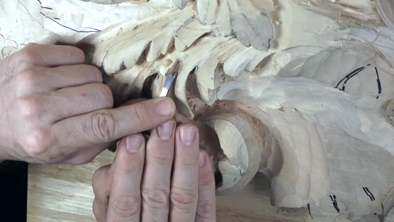

In part 7 of Venice Room 45, I looked at one spot on the carving and said it would look visually better. That word turns up in many of my courses. Here are the places, with what came right before and after.
Ever run a finger over a wood carving and find a bump you could not see? Or stepped back and wondered if a change will read from where the viewer stands? Both happen at my bench.
The places I said it, at a glance
- A point that sticks, in the lesson where I said it first.
- Bumps and high spots my eye missed, and my finger or tool found.
- An edge and a line the eye still reads.
- A row of widths.
- Marker, charcoal and shadow, the things I use to see a form before the wood shows it.
What did I decide in part 7?
Part 7 opens on a cut. "Use this concave also, and I can probably just do a finished cut right here with no problem." I said I'd work on this element, and then I named the challenge: "So now I need to solve for one of the challenges."
The area looked "somewhat fine," but I "kind of don't like that this is sticking on the same line, and it does not create the flow." Even the position of the point "makes the big difference in my opinion."

What I have to do, I said, is "just like an invisible arc, just like that." Next, chop the spot out and make it slightly wider, I said. "Don't have to do it a lot." Then a warning to myself: "Got to be careful how I do it."
Then came the line this page is named for. After it: "Maybe just undercut right away pretty much this way." And: "And now I can develop this idea."

That idea needed a detail underneath, and doing it like this lets me create it, I said. My tool was a number 11 gouge veiner at 3 millimeters (0.12 in). A warning about the view from above followed. You see only the stretch between this point and that point, I said, "but don't fool yourself. I do have a full property going all the way like that."
A number 11 at 2 millimeters (0.08 in) was the next plan, "all the way underneath." Why? "Because I really want to recreate that separation on this side." From the bottom, "It should look really nice." The piece would be small, "just a small piece like that. But still, it's got to be there in my opinion."

With a mallet and the bigger tool, I planned to create that separation. Then: "you can probably see much better the development of this idea." A small tool came next "just to create that movement," and that movement "has to be underneath." My plan: indicate from both sides how it should look.

The end of the piece had options: "there is a few different possibilities of development. Because I have a thick piece." I could leave it, "give a flip, like a flipping over and get concave," or go around that side and keep going. Then a warning to myself about "overthinking, which I do not want to do." The middle line came next, "right here," and I said I'd chop probably a little bit of that side.

What can my eyes miss that my finger finds?
A smaller gouge, like number three, was my plan for Lily Box 7, to check for micro bumps. "Which visually I can't see, but I can feel it by finger." Using a finger, I said, "is a good practice." My line was still visible on both sides, yet a "small, tiny bump" hid in it. I couldn't see it, "first of all, because of the grain, and I can just detect it by the finger."

A second case sits in Lily Box 8. I planned a number seven at 14 millimeters (0.55 in) to blend a little better, and I could see some high spots. A line starts on one side and continues on another one. "And visually I couldn't even detect that I had some high spot." My tool did: "I was able to hit that," and the transition became "really, really nice and smooth."

Some things are too small to see, so I carve them anyway. Lily Box 2 shows it. I lowered my stem, rounded my flower slightly and made a small V in this section. Nobody can see that kink or that sharp point. "Visually, it's almost impossible to see because we're talking about half a millimeter (0.02 in) right here. So it's not much, but still that's what I want to do."
The same lesson has a cut I kept shallow. "I really can't go too deep," I said, and one reason was "I don't need to." Visually, that depth is not detectable. The second reason: a cut too deep would make that section of the leaf really weak.
Over in the dotted background lesson, I wasn't going to worry about getting inside of the really tiny spots. "Of course, you could." You could buy two sets the same and grind that to 1.5 millimeters (0.06 in) if you wish, leave one row, and get to those spots. "I don't think it's really necessary because visually you're not going to be able to catch it." The regional carver didn't do that, and if he didn't, I said, I won't either.
A measure comes in part 1 of workshop 45: another layer, which means about two inches (51 mm) between this point and that point. Then I said: "So how deep it is." That line sits right before this one: "Which visually you almost don't see."
What does the eye still catch?
Hashemi flowers 45 keeps a shape through all the movement. "I still keep my overall shape. Shape is still the same, round. Because visually, you still catch that edge and it's just the same round." The crazy movements on the petals "just create beautiful thing."

A return in the furniture panel design course does the same for a movement. My return would go this way, I said, and then: "I kind of unite this space and I unite the movement." Visually, I said, the movement is still there to see. A hidden line got hit too, one that is not visible because it just disappears.

A test for my middle line sits in Lily Box 3. Once I remove the paper, my middle line is no longer distinguishable, I said, and it must be "visually distinguishable." Number seven, with a careful concave cut on the side of it, was the plan. In another part of that lesson I left less than 1/32 of an inch (under 0.8 mm), and that could create a problem. "My goal is to make visually this middle part of a leaf distinguishable. So for you can detect it."

With number seven, I wanted "a flowing line or a tangency to my stem," so that visually "it just looks like it's flowing to the same direction."
A curl can look bigger. For Lily Box 10, my plan was to remove a part and undercut underneath both sides. That gives me "visually that is much bigger just because it curls." I picked a number eight, first said as 3 millimeters, then fixed: "it's actually 3/32nds," about 2.4 millimeters.

A dome under a flower turns up at Lily Box 12. A space on one side was a little too thick, so I took advantage and created a dome underneath, "just for the shadow's sake. Never going to be visible. But shadow will be beautiful." On darker woods it's harder to detect those shadows, and the more exaggerated they are, the more beautiful the look. "More separation visually."

On the hazelnuts course, a first cut was "just preliminary, like establishing the borders, if you wish," and "just visually to see where" my separations will sit. From above you can't yet detect it, "or even from different points of view." I want to make sure it is full 3D and blended, and the section was not deep yet.

How do I judge a change by how it reads?
Venice Room 34 has widths that did not look right, so by the law of rhythm one needs to be a little smaller. "If this is the widest, this is less wide, and that has to be even less wide. That way it's going to make more sense visually, okay?"

A repeated movement comes in Venice Room 74: "somewhat parallel to this movement, but it still has to taper out." That was my center line, and "visually really nice." I wanted to utilize as much space as I could. "If you remember the golden ratio, 62% or 60/40," I said, makes it easier. Then: "To be exact, it's a 62% and 38%." That was my boundary.

The Tray of Blessing puts the question to you. One option: move my center line a little closer and create 60 40. "See that 60 and 40, can you see that visually? Like golden ratio again." And if the golden ratio feels uncomfortable, "don't overcomplicate stuff."
In furniture panel 19, I just barely touch about 1/32 inch (0.8 mm), and there was a reason: I was still going to undercut. Visually, it would be "much, much better" done that way. Another limit comes in part 5 of that lesson: "maybe about 1 millimeter (0.04 in), okay? That's the biggest spot." Still, "I still visually don't want to destroy my point of view."

A spot at Venice Room 60 probably doesn't look too good on a camera, I said. "But it makes sense, actually, because visually, this piece is going to go underneath." Then: "if I don't like it, I'll fix it. I'll change it."
What helps me see a form?
A shadow helps first. In Roman acanthus 9, I planned to undercut the area under a curl. "It's not the final undercut." I just want to create a shadow, I said, so I'll see visually what the next step is. The tool: just number five, a quarter inch (about 6 mm), and I need to be careful not to damage the straight line.
The tool itself can show it. Greek acanthus 3 puts one chisel part 90 degrees down, and a V tool at 45 degrees would be really good too. "You can actually control more because you can see visually where is your 90 degrees." In Greek acanthus 11, a line did not look even. I took number three and worked against the grain a little at a time, for more control on a flow. I could "actually visually see that section was taken out right here. That means there was not even line. So and now it is."

For a drawing I use charcoal for shades, and I put in light spots where I can "visually see" my higher points. That comes from furniture panel design 13.
A marker does the same job on the wood, and Lily Box 4 gives one of the reasons I mark my high and low spots. Without marking, you re-look at the reference and go back and forth. "And you're losing time, actually." Once you identify the high spots visually, you can jump to the area, I said, a much quicker process.
A cleaner surface helps too, as Lily Box 6 shows: "Clean a little bit where I can see visually better." Next, a number three could create a clear separation right here. Then: "Now I can see what is going on. I can work the details out."
One more, at Lily Box 4: a really small chamfer, maybe one millimeter (0.04 in), with a number three at one-eighth inch (about 3 mm). A chamfer like that? "You can catch it visually," I said, and it gives a classical look.
Where did I say it, and what came next?
The table lists six of them, side by side.
| Where | What I looked at | What the word did for me there |
|---|---|---|
| Lily 7, second layer | A tiny bump under the grain | Found by finger |
| Second layer, Lily 8 | A high spot where a line continues on another one | I couldn't even detect it, but my tool hit it |
| Hashemi 45 | The round edge of a petal | I still catch that edge, same round |
| First layer: Lily 3 | The middle line, under paper | Visually distinguishable |
| Law of rhythm, Venice Room 34 | Widths that don't look right to me | More sense visually |
| Dotted background | Really tiny spots I would not worry about | I don't think it's really necessary |
Where can you find these lessons in my courses?
Each one sits inside a course of mine, and Venice Room Part 4 holds workshops 38 to 49. Every course is one click away if you start here.

How it's done
- Find the spot that sticks. Look for what does not create the flow. I did not like it, even though it looked somewhat fine.
- Check the position of the point. It makes a big difference, I said. The point should move like an arc, just movement like that.
- Chop it out and make it slightly wider. It did not need to be a lot, and care is needed in how I do it.
- Cut the detail underneath. The number 11 veiner for the detail, then a plan to go underneath with a thinner pass.
- Weigh the ways to finish the end. Leave it, flip it over, or take it round the side. Overthinking is a risk I named.
Frequently asked questions
What was my first challenge here?
I needed to solve a challenge. That area was somewhat fine, but one thing stuck there, and the flow was missing. Even where the point sits, I said, makes a big difference.
Which tool did I name?
A veiner, number 11, at 3 millimeters (0.12 in). The plan was a 2 millimeter (0.08 in) pass beneath it, to recreate that separation on this side.
Why did the end of the piece have several options?
I had a thick piece, and it would not be visible only from a far point. Options: leave it, give it a flip and get a concave, or take it around the side. Overthinking, I said, is a possibility, and not one I want.
What to carve next