
Alexander Grabovetskiy, woodcarver, School of Woodcarving · Published 2024
How much should you exaggerate a shape in a carving?
Quick answer: Exaggeration in carving means pushing every swell and hollow past what a real leaf does, because room light reaches a panel from one side and washes out gentle modelling. A shape that looks slightly overdone while you carve it is usually the one that still reads from across the room.
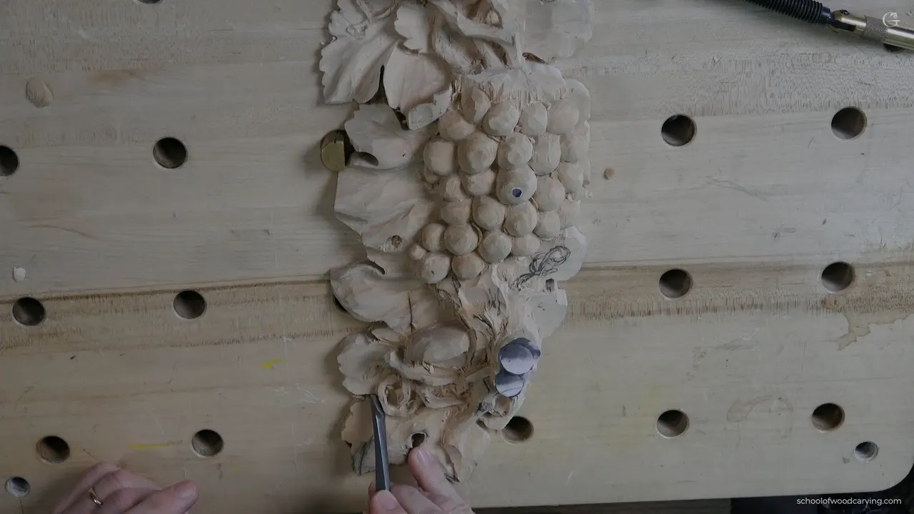
Carve every shape further than it goes in life. A curve that looks correct while you carve it flattens out the moment the piece is on a wall, because room light only ever reaches a panel from one direction, washing out anything gentle. What survives that trip is the shape you pushed too far.
This workshop is the one where my grape panel gets its leaves. Not the tendrils, not the fruit, the broad surfaces underneath everything, and they are where beginners lose their nerve. A lobe gets a soft swell, a ridge gets a polite bump, and the whole leaf ends up reading as a flat plate with lines scratched on it.
I have been carving for over forty years and I still push shapes further than feels right while carving them. Then I stand the board up, walk six feet off, and it looks about correct. That gap between what your hand believes and what a wall shows you never fully closes, so you learn to carve for the wall.
Key takeaways
- Room light comes from one direction. Gentle modelling vanishes under it.
- Push every swell and hollow past what looks right while you are leaning over the work.
- Shallow work looks like a failure until the undercut puts shadow beneath it.
- Acanthus wants more exaggeration than a grape leaf does, and the grape leaf hands you a good deal more freedom in return.
- Blend with the widest tool that fits.
- Stand the piece up and look from six feet before deciding anything is finished.
Why does a carved shape disappear once it is on the wall?
The light at your bench lied to you. Sitting over the work your eyes are directly above it, a lamp is usually right there too, and every small change of surface throws a visible edge. No carving will ever get more flattering light than that.
A wall gives you none of it. It comes in from a window or a fixture off to the side, strikes the panel at a shallow angle, and only shapes with real depth catch it. Everything gentler turns into one continuous pale surface. The carving you were proud of ends up a board with a pattern on it. That is true of carved wood generally, not just leaves.
So the working rule is not about taste. It is about the physics of the room the piece will live in. I am not carving a leaf, I am arranging where dark will fall, and a hollow that is half a millimetre deep arranges almost nothing at all.
Check it while you work. Pick the board up, turn it so the light rakes across the surface, and see which of your shapes survive. The ones that vanish are the ones to go back into. That single habit will teach you more about depth than anything written down, including this page.
How far past life should you go?
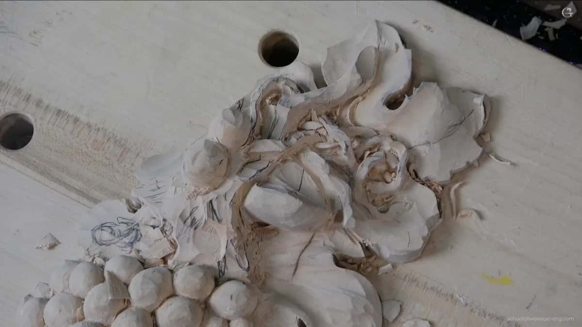
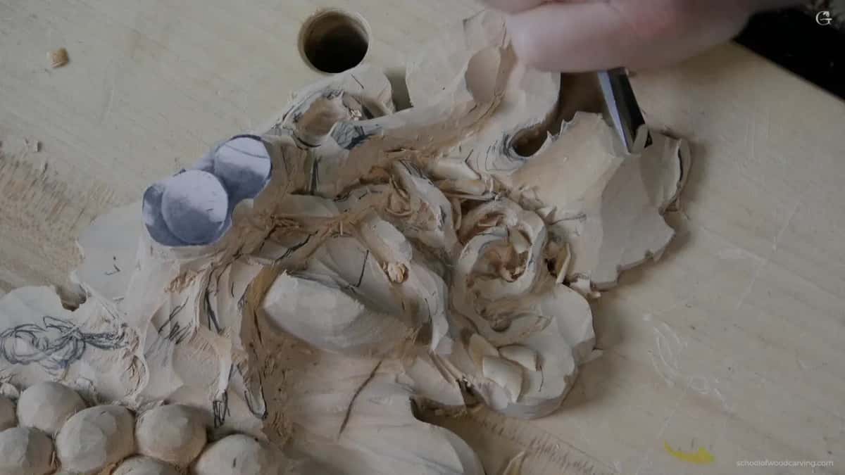
Further than your hand wants to, and the honest measure is that it should look a shade wrong from close up. I took the central swell on this one up until it looked overdone from twelve inches away, then left it there. Tip it under a lamp and you can watch the shape appear and vanish as the angle changes, and there is the whole argument in one movement.
Carving in wood is interpretation rather than copying, and this is where that distinction stops being philosophy and turns into a decision. A real leaf bulges very gently. Copy that gentleness faithfully and you have carved something nobody will notice from across a room.
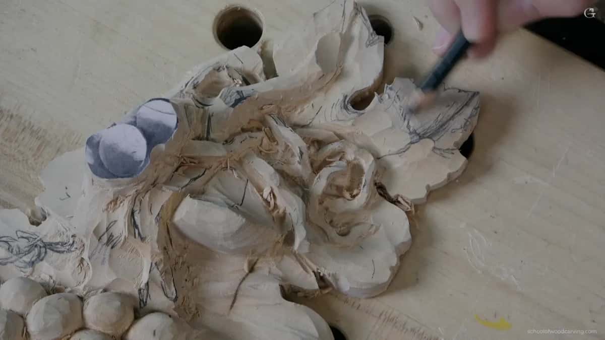
There is a ceiling, obviously. Go far enough and the leaf stops being a leaf and becomes a lump of dough, and I have seen plenty of carving that crossed that line trying to look bold. The test I use is whether the shape still explains itself. A swell that tells you where the leaf is growing from is doing its job however pronounced it is. One that exists only to be deep has stopped saying anything.
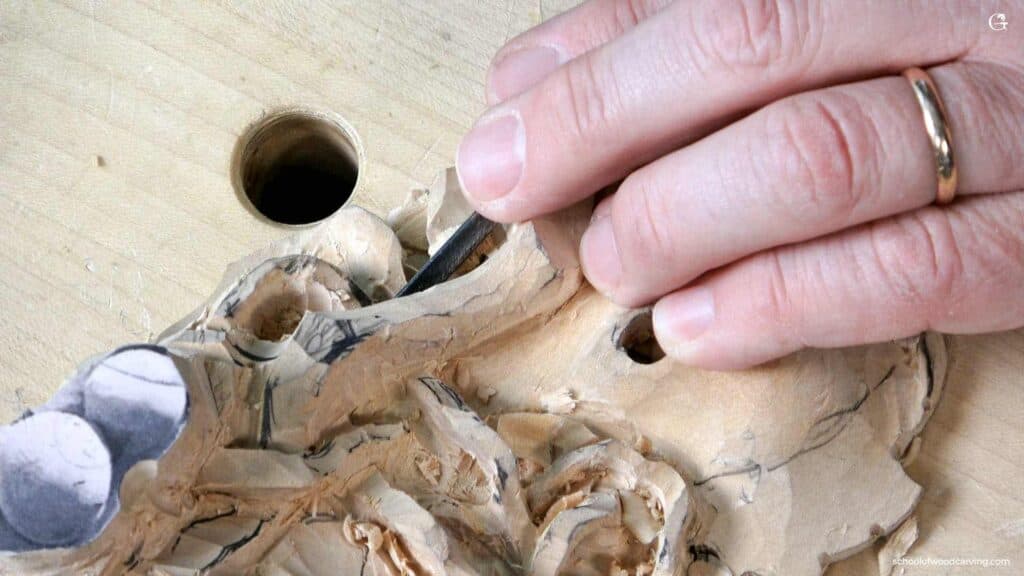
My own leaf here rolls as well as bulging. The middle lifts, then the whole surface tips slightly leftward, and at the tip there is a small flip backward. None of those three moves is dramatic on its own. Stacked on one surface they make it read as something that grew rather than something that was drawn.
What makes the modelling look like nothing until you undercut?
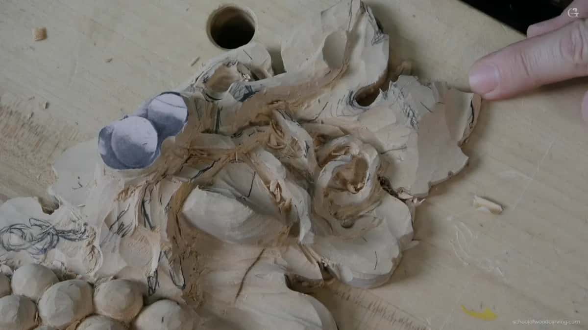
Shadow is what makes a shape visible, and until there is an undercut there is nowhere for shadow to sit. This catches everybody, and it is the single most demoralising moment in a project like this.
Here is the sequence. You spend an hour modelling a leaf, stand back, and it looks like you did almost nothing. Every instinct says the shapes are too shallow and you should go deeper. Resist that, because the problem is not your modelling. The edges of the leaf are still buried in the board, so light wraps around them and nothing reads.
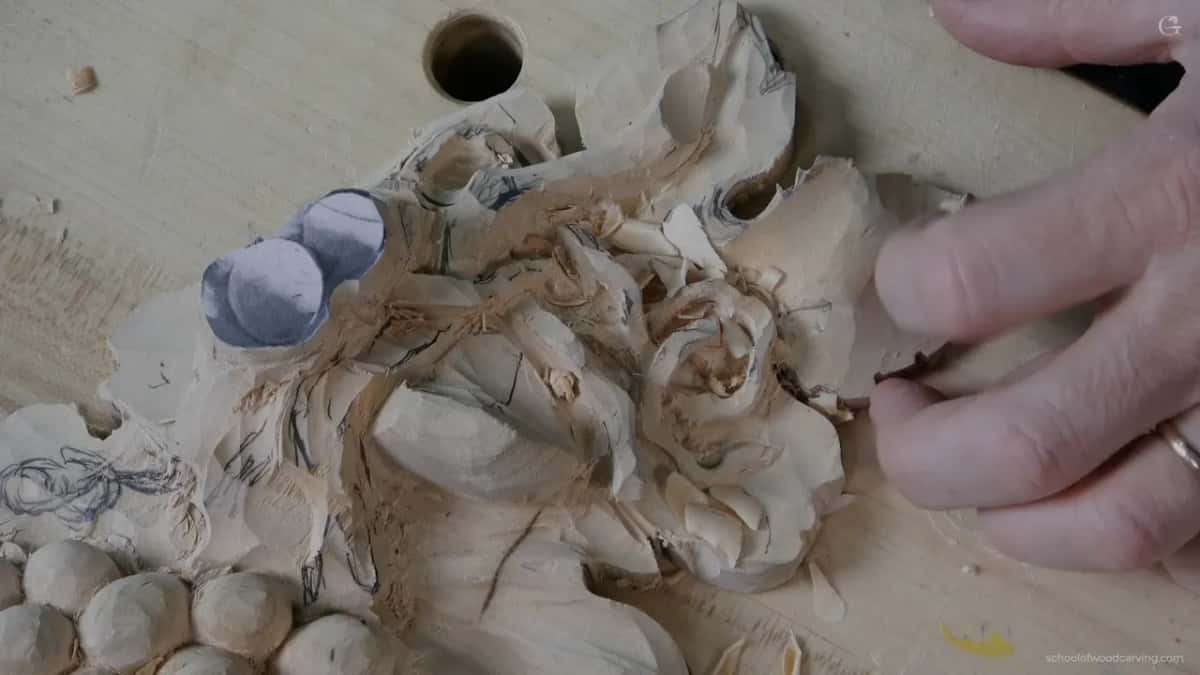
Then the undercut goes in and the whole surface changes in about four minutes. A dark line appears under every edge, the swells suddenly have something to be lighter than, and the modelling you thought had failed turns out to have been right all along. It is not much, and it is not big, but once you start undercutting you see the difference it makes.
| Move | How deep | What it adds to the panel |
|---|---|---|
| The central swell | a few millimetres across the whole lobe | Makes the leaf read as something that grew |
| Rolling the surface | subtle | Stops the surface looking pressed flat, and gives the light somewhere to travel |
| A flip at the tip | small | One moment of life on an otherwise calm surface |
| Undercut | two millimetres rather than one | Turns every shape above it visible, and this is where most of the effect actually comes from |
| Final blending | the lightest pass you can make | Removes the facets without flattening what you just carved |
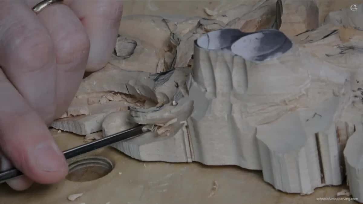
Two millimetres of undercut against one reads as a completely different carving under a lamp. Same shape from straight on, twice the drama from anywhere else, and I argue for more of it rather than less on anything that will hang. The tendril workshop takes that idea to its limit.
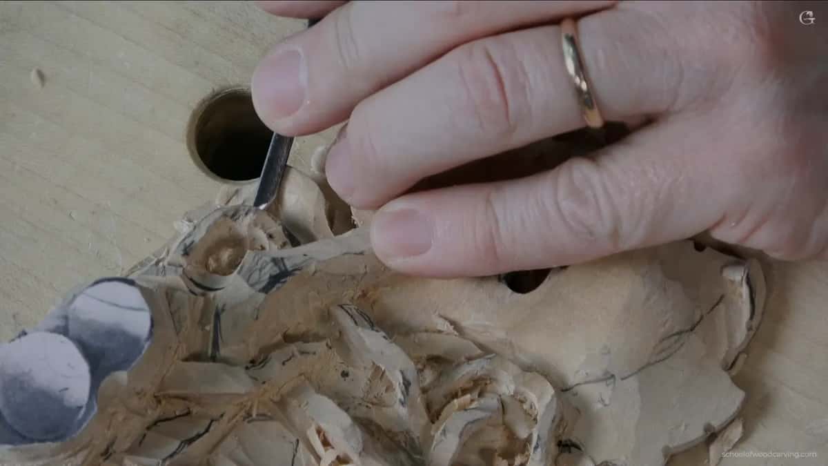
Does a grape leaf need as much exaggeration as acanthus?
Less, and it also forgives more. On acanthus the raised ridges are the whole grammar of the ornament, and if you undercook them the leaf stops being acanthus and becomes a generic frond. There the exaggeration is not optional.
Grape leaves let you off. They have a looser shape in nature, the lobes are broad, and nobody carries a precise mental template of one the way they do for a classical leaf. That freedom is why I enjoy them. You can put a concave where you feel like it and a convex somewhere else and the leaf simply absorbs the decision.
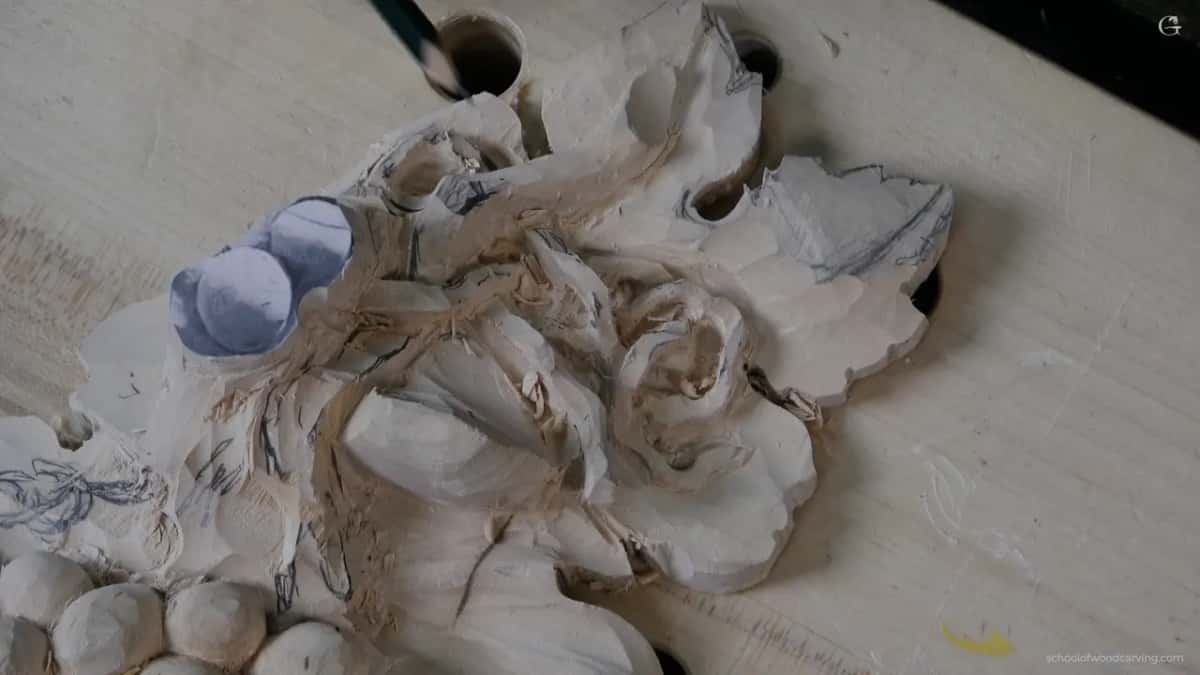
Exaggeration also runs in reverse sometimes. In certain Italian Florentine Baroque work the ridge that should be raised is carved as a hollow instead, and it looks deliberate rather than wrong. I mostly follow the raised logic on this panel, but knowing the reverse exists tells you the rule is a convention rather than a law of nature.
My advice for a first leaf is to go too far on a scrap and see what too far feels like. Carve three of them on an offcut of basswood, make one timid, one reasonable and one ridiculous, then stand all three against a wall. The ridiculous one usually wins, and that result stays with you longer than a paragraph does.
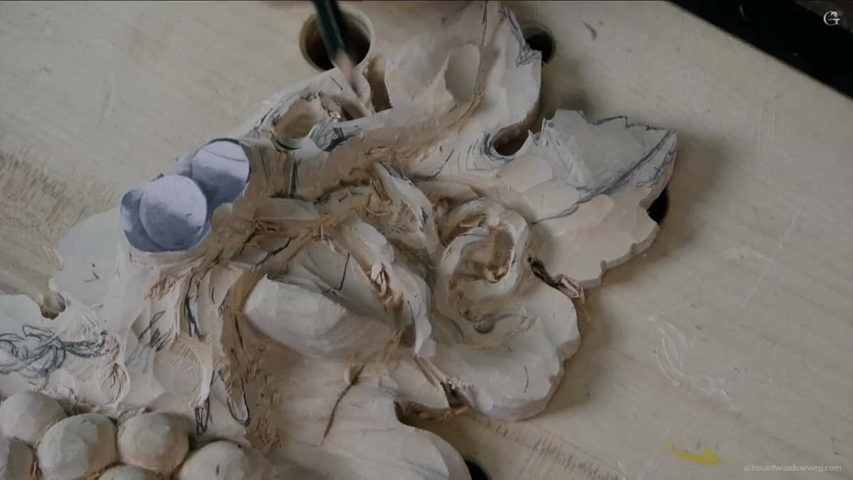
Which tool blends without flattening what you just carved?
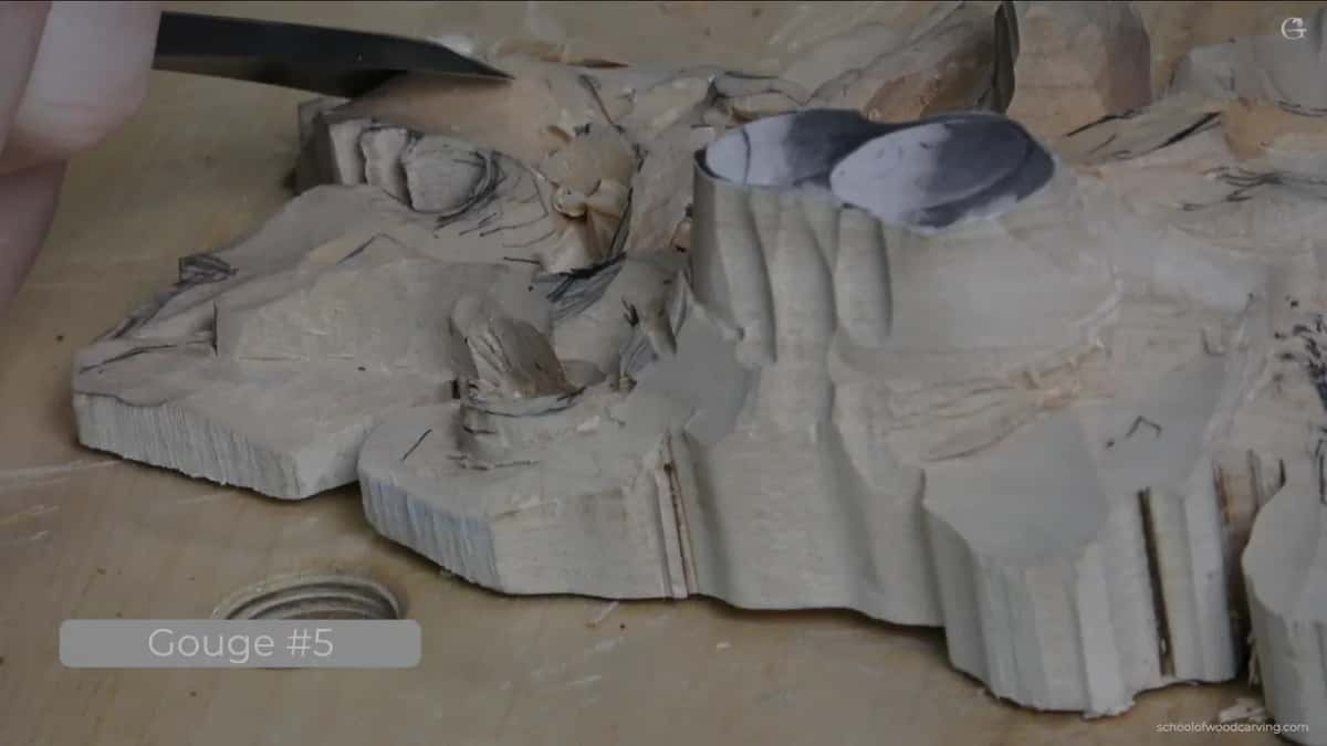
The widest one that still fits the curve. Small gouges feel safer and they are the reason so many leaves end up looking chewed, because every narrow pass leaves its own edge and then you have thirty edges to reconcile instead of three.
Blending goes up in size rather than down. Number 5 for the shaping, then the same number 5 in a full inch for smoothing, which gives a longer, sweeter cut and leaves far less to clean up afterwards. Fewer cuts is the goal. Not smaller cuts.
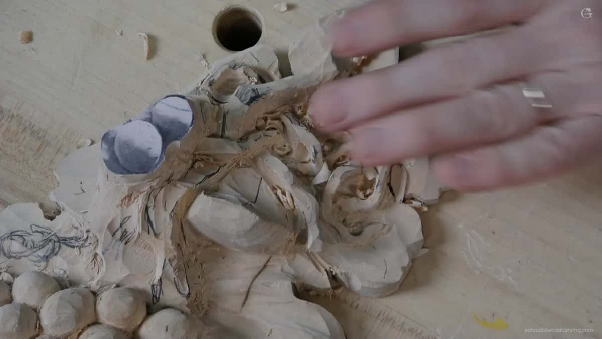
Direction matters as much as width. Where a hollow runs into the grain I use a spoon and work from the inside outward, because coming the other way the edge catches the fibres and lifts them, and on a surface this thin that is damage rather than a rough patch. A bent gouge reaches in where a straight one cannot start the cut at all.
Sharpness is what makes any of it possible. Carving along the grain on a leaf edge is genuinely risky, and the only thing standing between a clean pass and a broken lobe is an edge that slices rather than pushes. I do not press. I let the tool do it, which is a sentence that sounds like advice until the first time a dull gouge takes a piece off and then it sounds like experience. Sharpening is the course underneath every other course here.
What do you check before you call a leaf done?
Four things, and none of them involve looking straight down at the bench. That view has already told you everything flattering it is going to tell you.
Stand it up first. Six feet back, ordinary room light, and ask whether you can read the leaf as a leaf. Tip it so light rakes across. Watch which shapes hold and which wash out, then look along the surface at eye level to check the roll is really there rather than remembered. Last, turn the whole panel upside down, which sounds odd and is the fastest way I know to spot a lump that your eye had stopped seeing.
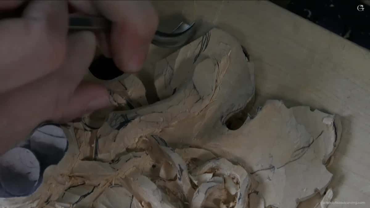
Do not do the final cleaning yet. My hands darken basswood as I work, everything on this panel gets touched again before it is finished, and a surface cleaned now is a surface cleaned twice. That decision alone saves hours across a project this size.
Expect to find damage too. I found a crack in the side of this piece while I was working, a small one, still strong, and it will take glue rather than panic. Wood does that. Finding it early and carrying on is most of the craft, and the third workshop covers how a piece gets into that state in the first place.
How much wood do you need left to model a leaf?
More than you will have if you did not plan for it. Exaggeration costs material, and the swell you want to push is carved out of thickness that somebody, usually you, already decided to remove three sessions ago.
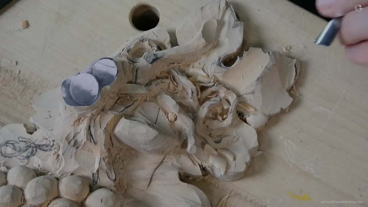
On this leaf I am working with about an eighth of an inch at the thinnest point and roughly six millimetres on the far side. That is tight. Every pass gets measured against it, and there are shapes I would like to push further that I simply cannot, because the wood behind them is already gone.
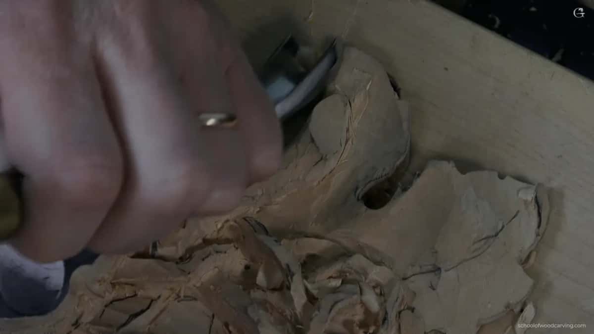
The lesson is not really about leaves. When you excavate a background or drop a level early in a project, you are spending depth that the modelling layer above it will want later. A relief panel is a budget, and beginners overspend at the start because lowering a background feels like progress.
So carry the question forward. Before dropping any area, ask what has to be modelled on top of it and whether a few more millimetres would help later. On a two inch board like this one there is room to be generous. On thin stock you ration from the first pass. Buy thicker material than feels necessary, even though it costs more.
Where the eyes and pipes of the leaf fall decides a lot of it too, since those raised ridges need the most thickness of anything on the surface. That grammar is the same on a grapevine as on a classical leaf, and the second workshop shows the stage where that thickness is still yours to keep.
Where else does this rule apply?
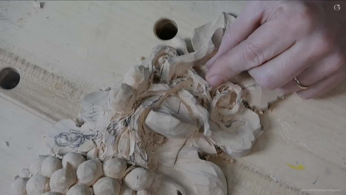
Everywhere light falls on carved wood, which is everywhere. The further a piece will sit from the viewer, the harder you exaggerate, and architectural work takes this to extremes that look absurd in your hands.
Carvers who worked on cathedral fronts cut shapes so bold you would call them crude at arm's length, and from the pavement fifty feet below they read as delicate. Grinling Gibbons understood the same thing indoors, which is why his fruit still reads across a long room three hundred years later, and why the same instinct runs through Rococo ornament after him. The design course goes into how distance changes every proportion you choose.
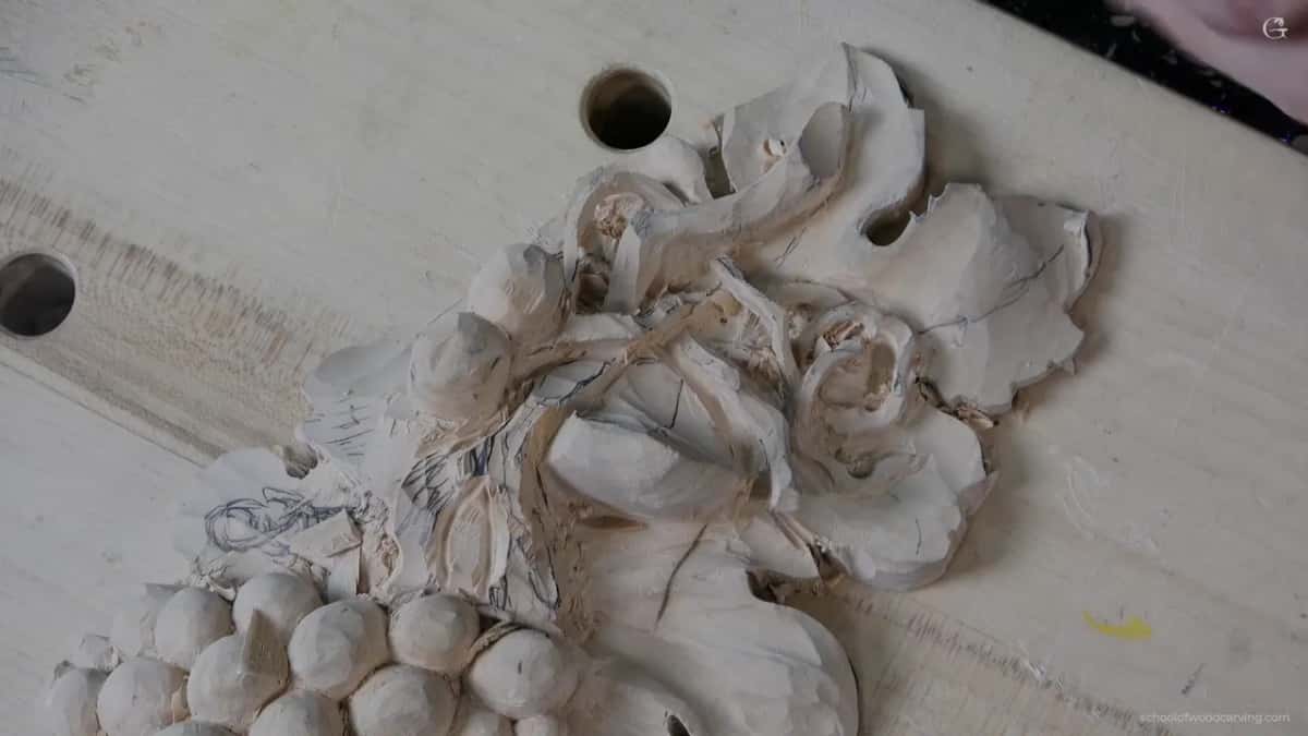
Start smaller than a grapevine. A flower rosette gives you one shape to push and nothing fragile to break. An antique style rosette adds a second level, and a Greek acanthus leaf forces the exaggeration on you whether you like it or not. The beginner course starts further back.
What I would ask of you is the six foot test, whatever you carve next. Put it on a wall, walk away, turn round. Your hand will argue with your eyes and your eyes will be right. That one habit separates carving that photographs well from carving that lives in a room, and it costs nothing but the walk. If you would rather have somebody standing behind you while you learn it, the in person classes are where that happens.
How it's done
- Decide where the piece will hang. Work out which direction light will reach it from, because that single fact sets how deep every shape on the panel has to be.
- Push the main swell first. Take the central lift of the leaf up until it looks slightly overdone from a foot away, then leave it alone.
- Add a roll and a flip. Tip the whole surface over toward one flank and turn the point back on itself, so three separate moves stack on a single leaf.
- Stop and rake the light. Turn the board so light crosses it at a shallow angle and note which shapes vanish. Those are the ones to deepen.
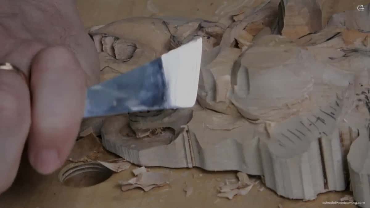
- Undercut before you judge. Put two millimetres of shadow under the edges rather than one, since the modelling above will not read until something dark sits beneath it.
- Blend with the widest tool that fits. Finish with a broad sweep instead of a narrow one, leaving three facets to reconcile rather than thirty.
Frequently asked questions
Can you exaggerate too much?
You can, and the sign is that the shape stops explaining itself. A swell that shows where the leaf grows from is doing its job however pronounced it is. One that exists only to be deep has turned into a lump.
What makes a carving look flat in photographs?
Most likely the light is coming from behind the camera, which is the one direction that flattens everything. Swing the lamp round so it rakes across the panel and the same carving will look twice as deep.
Does a grape leaf need as much exaggeration as acanthus?
Less. Acanthus depends on its raised ridges being emphatic. A grape leaf has a looser shape in nature and forgives a gentler hand, and I enjoy carving them for exactly that reason.
What to carve next