
Alexander Grabovetskiy, woodcarver, School of Woodcarving · Published 2025
What does readable mean in wood carving?
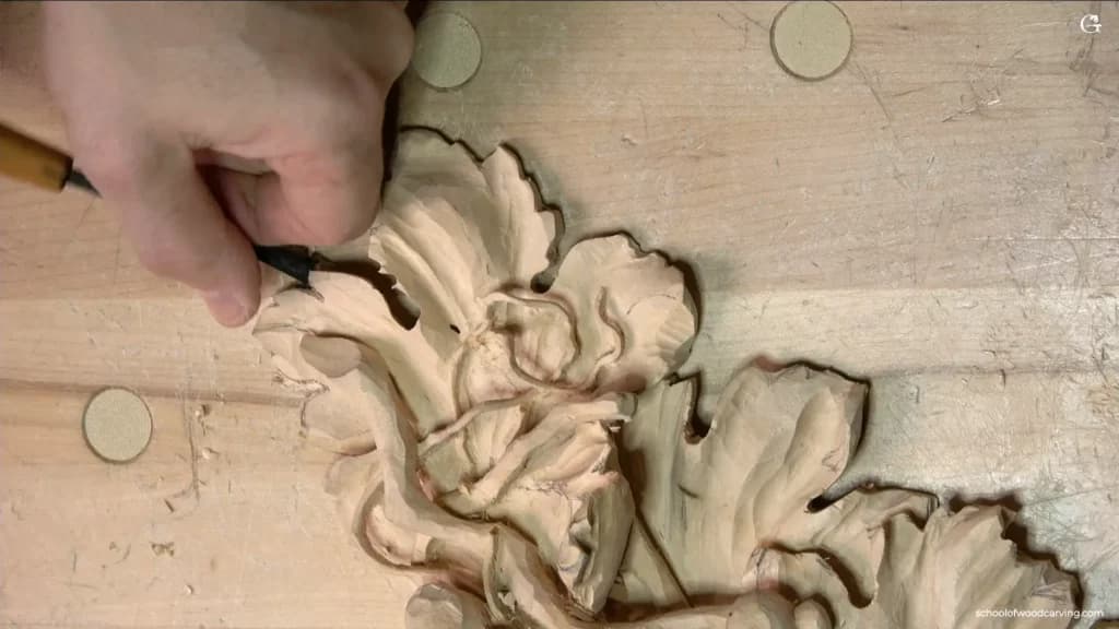
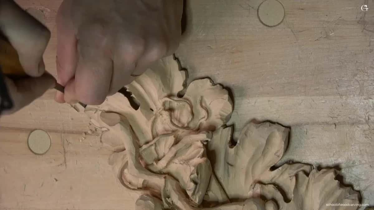
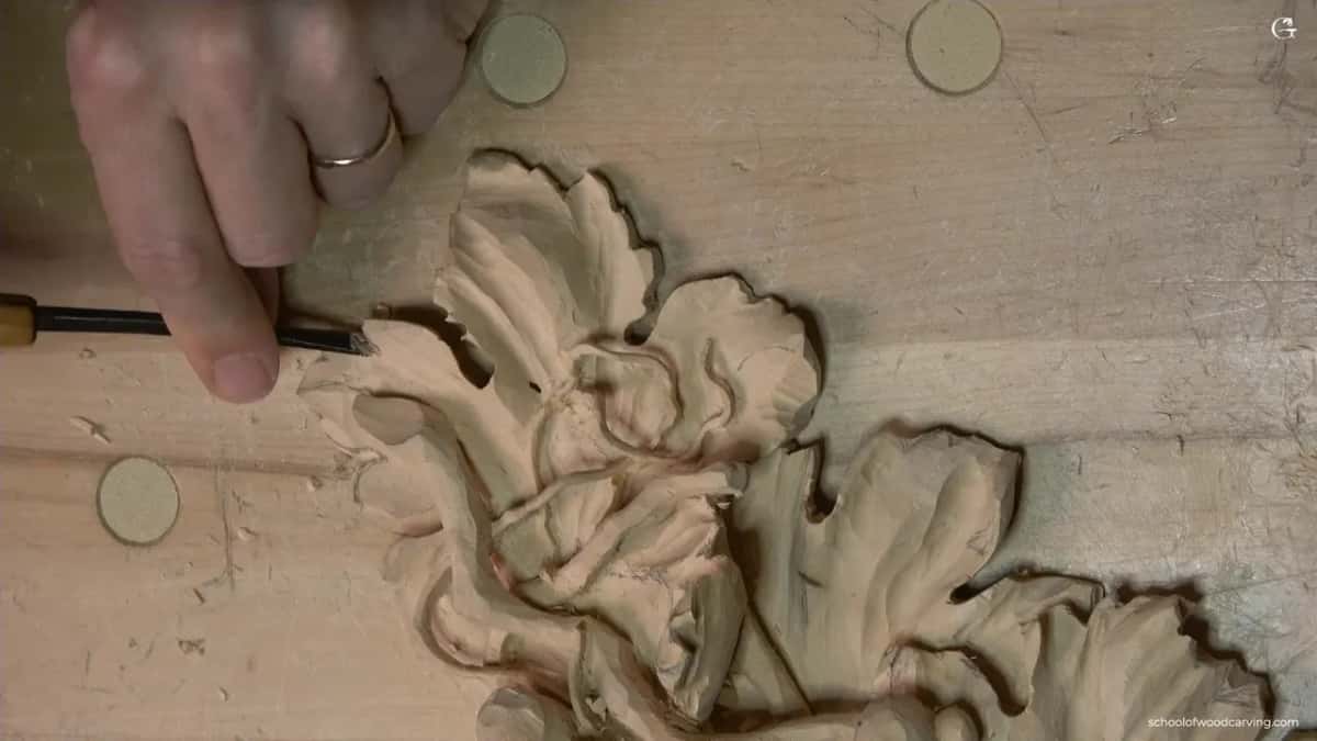
Quick answer: Readable in wood carving is how I describe a shape whose idea and motion people can follow. On my grape onlay I dug a slight concave beside a leaf's central line, with a number 7 of about 1/4 inch (about 6 mm), to exaggerate it as a pipe for the motion's sake.
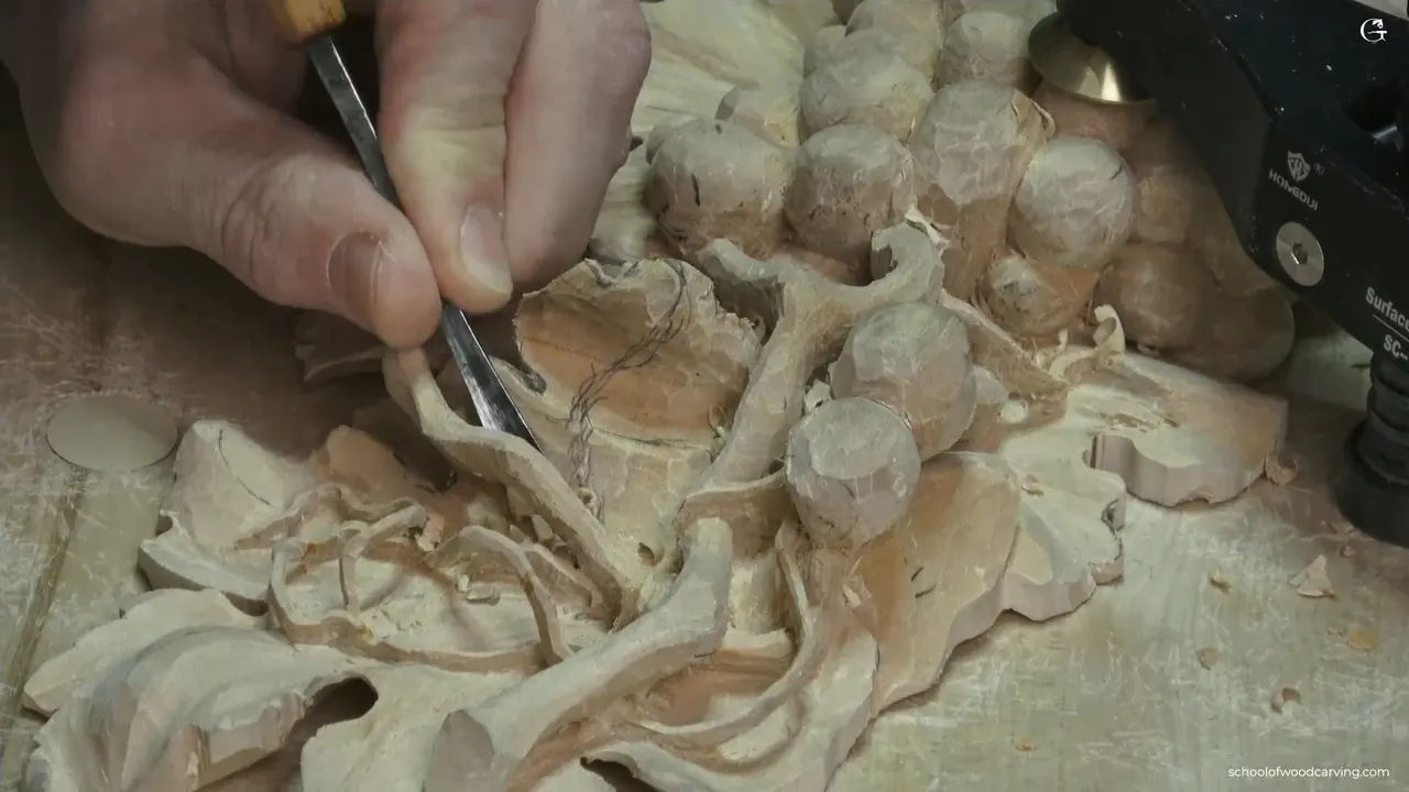
Readable in wood carving is my word for a shape that people can understand, what the piece is and which way its motion goes. On my grape onlay, in the last video of lesson 14, I pushed the central line of a leaf with small concave cuts, so its overall motion would read. The word comes up in my lessons again and again. So the relief carving tips below come from several wood carving projects, and each one is tied to the place where I said it.

Have you ever carved a leaf that looked right from your bench, then looked flat and quiet once you stepped across the room? Do you want its motion to show? Then start with the slight hollow next to the middle of the leaf.
I'll show you the tools and sizes from this part, the spot where I stopped and left the rest for later, and the same word on my Venice Room course, a furniture panel, an acanthus panel over moldings and a Gibbons class in Maine.
What I look for before I call a shape readable
- A slight concave beside the central line, so the motion of the leaf can be read.
- Tiny is fine.
- A tiny ridge with hardly any hollow beside it still read, and shadow carries it even where the camera hardly shows it.
- Even the thin edge of the leaf took some motion.
- Within an arching part, I wanted a hint of the letter S, kept small.
- A division that went almost unreadable got cleaned a little.
Why push a central line as if it were a pipe?
To make the motion read. I opened the last video of lesson 14 by digging a little more wood out right beside the central line of the leaf, in a concave motion, just slightly, going toward that line. I picked up a number 7 of about 1/4 inch, about 6 mm. It is not really a pipe, I told the camera, but I was still going to exaggerate it as a pipe.
The pipe, on my leaves, is the raised part that runs out of an eye, where two lobes come together, and the course page goes through that rule. This time it was just for the motion's sake. Otherwise, I said, you won't read it, and the overall motion won't be readable.
On a living leaf the vein down the middle has its own name, the primary vein, also called the midrib. The plant behind this whole onlay is the grapevine, genus Vitis.

Making that with concave cuts was really important to me. You can do another one right beside it, I said, but be careful how you do it. I didn't want to go past my central line. You could also attack from the other side and make that motion there. I said I'd probably do that a little later, at the cleaning stage, because I didn't know yet if I was going to change something. For now I was happy.

Later in the same video I came back to the central line with that number 7, a quarter inch, I think, for one more concave cut. The grain direction made me change to two different angles of attack there, and I worked from the outside, from the edge first, to lower the whole edge down.
Who is a carving readable for?
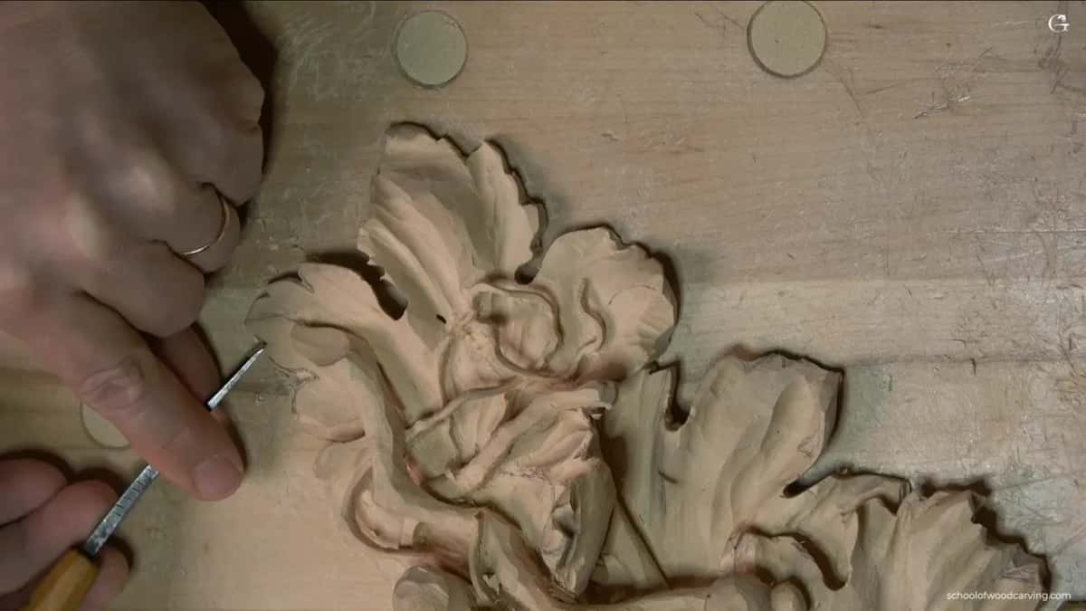
For the people who look at it. Back in workshop 42 of the Venice Room I said you're not going to see too much from above, but it will be visible when you stand at the far point of the room. Still readable, I said, and then I put it another way. Visible.
I was freeing one piece in workshop 56 that belonged to a bigger movement, and I wanted it readable in the overall design. People should understand what is going on and what that piece is. After that I went in little by little, removing plugs and taking my time. One pass, flip the tool, another pass, deeper and deeper. Patience, I said, is the biggest secret.

Close up, you can miss it. Lesson 8 of my acanthus over moldings is where I said that when you look really close, you don't really see the overall movement, but when you look from above, it's readable. Your brain reads that movement.
How does a concave beside a ridge make it read?
It gives you shadow. During workshop 82 I refined a concave and said it would give me some shadow, really good shadow, actually. My next move was to blend toward the middle line with the left wing of my tool, because I really wanted to see that middle line ridge. It has to be readable. The right wing only blended a little.
Sharp ridges were the next thing I didn't want to see. A flatter number 3, about 10 mm (3/8 in), turned them into more of a transition to the convex.
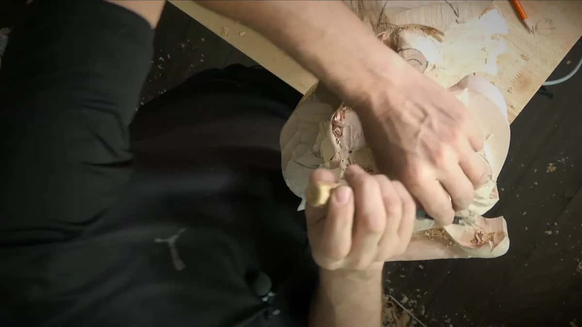
Workshop 59 was where I made small concaves along the sides of a middle line, with a 4 mm number 11 (about 5/32 in), going upward and trying to be as accurate as I could. They were small. Still readable by the human eye, as I said in that workshop, and a couple of ridges came out of it that cast some shadow you could see.

A right-hand concave in workshop 57 leaned toward the left side, to make the shape more distinguishable, a little more readable. That ridge would be raised up. Still, I didn't want a deep concave closer to the middle line, or it wouldn't look nice.
Painters have a word for strong light set against dark, chiaroscuro. On a relief the dark part is a hollow you carve.
Does a readable detail have to be deep?
In a few of my spots it wasn't. In workshop 29 I ran a concave right along the side of a pipe, all the way, and then asked you to see what I'd just done. A concave on the side of the ridge, just readable, going downhill. Not really deep, but still detectable, and it was still a pipe. Workshop 28 got almost no concave, almost nothing, and it still gave me a small, tiny ridge the eye could read.

One spot in workshop 34 was not that deep either, but it would still read, and I said I could use just one millimeter (about 0.04 in) right there. The concaves and convexes in workshop 97 were not big movements in and out. More subtle, but still readable.
Size works the same way. The eye in workshop 40 was really tiny, probably one millimeter or one and a half millimeters, like 1/16 of an inch. I said I could exaggerate it so it would be more readable, or more visible, and that a number 8 would help me.
Can a very thin edge still show motion?
It can, and I said so on the grape leaf. Finishing that leaf, I looked at it from the side, and I had, like, two millimeters left (about 5/64 in), probably no more than that. But even with that little, you can still bring some motion right to the edge.

My 3 mm number 11 (1/8 in), the same one I'd used before, went in upside down with the flute at about six o'clock and took some of that wood off. I could attack some areas from inside outward, too. A few spots got really thin, less than that. To go deeper I took a 2 mm one (about 0.08 in), still a number 11, still upside down, in little, little chunks. Be careful there. When it doesn't feel safe, a wedge or other support underneath is a wise idea.

Do micro-separations make a leaf easier to read?
The grape leaf still needed three separations, and I didn't plan them all at one depth. Somewhat deep ones here, I said, with one going deeper than the other, and then some micro-separations. It should work fine.
The vase with grape leaves got it in a few words. Every concave creates some kind of triangle, and we want to exaggerate the triangle. So a smaller tool goes straight down, for micro-notches, micro-separations, and the triangle comes out. The result didn't look too good. That was what we were after, though, and wherever you see the ridge, a notch goes in.

For lesson 23 of my furniture panel I wanted to bring out the center of a flower. A 1 mm tool (about 1/25 in) went around it, because it had to feel like it had its micro-separations too. Otherwise, I said, it won't look nice.
Detail grows on you. I added extra micro-separations at the end of my Byzantine acanthus leaf, lesson 10. There's no end to what you can do, I said there, and since I did that, I had to do it everywhere. That style comes from Byzantine art, and the acanthus is one of the most common plant forms in ornament.
One division in workshop 34 was almost unreadable, so I cleaned it a little, and I said twice that I wanted it readable. How I made the separations show on this same grape onlay is in lesson 9, and the way I divide a grape leaf in the first place is in lesson 8.
Where does a letter S help, and how much of one?
Inside an arch, and only a little. Further on, I liked the overall shape of the grape leaf, but I could make it better. I reached for a number 3 to give one spot a much better motion and some roundness. That part already had an overall movement, arching one way. So it was a good idea, I said, to bring in a complementary motion on the inside, almost like a letter S. Not much, but still. A letter S will help.
Painters and sculptors have their own names for that S. William Hogarth called an S-shaped line the line of beauty, and in figure sculpture an S often runs through a body standing in contrapposto.
In two Venice Room workshops the S came right after work on the middle line. At workshop 147 I had to bring one part closer to the middle line, or it wasn't going to be readable, and then came my separation and the letter S curvature. And in workshop 82, once I'd blended all the way to the middle ridge, I said it was a good area to create the letter S curvature.

Movement itself is a bigger subject. I go into it in the law of movement lesson of my design course and in workshop 38 of the Venice Room.
Should a shape read before it is clean?
On this leaf the shape came first and the cleaning second. I cleaned with a number 3 of 6 mm (about 0.24 in), working from two sides and changing position. I didn't worry about making it super clean yet, because I can always attack from the back side and undercut it. Still, remove as much as you wish.
Same order on my furniture panel, lesson 34. I really wanted the center of one petal to be readable, so a number 11 went in again, getting closer to how wide it was supposed to be, two millimeters (5/64 in), and I came at it from the opposite side. It was the rough stage. I wanted the flow to be really nice, with no straight lines, and the few I could still see, I can always fix before it's done.
In lesson 33 of that panel it was a movement I wanted readable. A small concave on the inside, in lesson 34, made with a tiny tool, would be readable because of the shadow it creates. You don't really see it on camera, I said, but it casts the shadow in real life. Don't make just a straight cut there. Follow the movement, the overall flow.
It didn't look too good yet in workshop 93, I said, but it would, and I needed to make sure the detail was readable. So I decided to undercut right away. I thought about one millimeter first, then half a millimeter (about 1/50 in).
Blending doesn't have to take it away. In my Gibbons class in Maine, lesson 10, I said that even if I blend those ridges, it's still going to be readable. Then I said I wanted to go much deeper right in the middle, with a concave there, and blend every pass into it. Grinling Gibbons was an Anglo-Dutch sculptor and wood carver.

Which tools made each spot read?
These are the tools and sizes I named in the spots above, in the order they come up on this page.
| Where | Job | Tool |
|---|---|---|
| Lesson 14, grape leaf | Concave dug slightly, aimed at the central line | Number 7, 6 mm or so (1/4 in) |
| Same leaf, thin edge | Motion brought right to the thinnest edge | My number 11 at 3 mm, an eighth of an inch, upside down |
| Inside the arch | Roundness and a little letter S, not much | Number 3, and I named 6 mm (roughly 0.24 in) for cleaning |
| Venice Room, workshop 59 | Small concaves on the sides of a middle line | A number 11 at 4 mm, about five thirty-seconds of an inch |
| Venice Room, workshop 82 | Sharp ridges turned into more of a transition | Flatter number 3, around 10 mm, close to 3/8 in |
| Furniture panel, lesson 23 | Around a flower's center, for micro-separations | A one-millimeter tool, about 0.04 in, went around it |
Which relief carving tips carry over to your own leaves?
My advice in these videos is short. Be careful how you take a second concave beside the first, and work the other side as well, for that motion there too. Follow the movement, the overall flow, instead of making just a straight cut. Where a concave leaves a triangle, exaggerate the triangle. And practice your patience.
I talked about standing at the far point of the room on the Venice Room, and about looking from above on the acanthus panel.
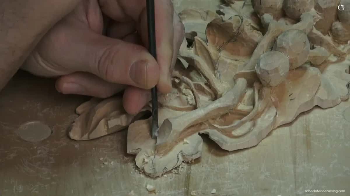
Do you want to watch that central line go in on the real leaf? The whole of lesson 14 is in the grape onlay course, and the tuition for every course is on the access page.
How it's done
- Dig toward the central line. My number 7 digs a slight hollow up to the central line, to push it like a pipe.
- Stop at the line. I don't go past my central line. The other side I leave for later, probably at the cleaning stage.
- Plan the separations. Three of them at different depths, plus micro-separations.
- Bring motion to the thin edge. With about 2 mm left (about 0.08 in), my number 11 of 3 mm (1/8 in) goes in upside down, flute at about six o'clock. A smaller one takes it deeper, in little chunks.
- Add a small S. Roundness for the arch comes from a number 3, with a hint of a letter S on the inside, kept small.
- Clean from two sides. A number 3 does the cleaning. Not super clean yet, because the back can still be undercut.
Frequently asked questions
Is readable the same as visible?
Close enough that I swapped one for the other once. A part on my Venice Room course would still be readable from across the room, I said, and then I called it visible instead. Another time I put it as people understanding what is going on, and what that piece is.
Do readable details have to be carved deep?
Two spots on the Venice Room were shallow and still read. Beside one pipe I left a concave that was not really deep, but still detectable, and the pipe still showed. Somewhere else there was almost no concave, and the tiny ridge it gave me could still be read by the eye.
Which gouge pushed the central line on the grape leaf?
The number 7, about a quarter of an inch, which is roughly 6 mm. I dug slightly, in a concave motion, toward the central line, careful not to go past it. I came back to it with the same number 7 later in that video, a quarter inch, I think, to work the central line again.
What to carve next